Brand Core, Mood & Identity for Cult Modern
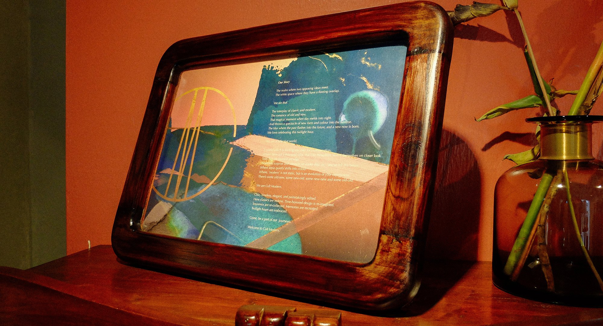
To understand what was at the very core of this design forward boutique store offering curated selections in fashion, lifestyle and art, we spent time to understand the vision for the brand, and the various elements that made Cult Modern what it is. After indepth sessions, we understood that at the very core, this brand was all about the in between space. The Twilight Zone - where one mindfully steps back to take a look ahead. The magical moment where day melds into night, where opposing ideas meet, it is that space between old and new, classic and modern. This was the essence of Cult Modern.
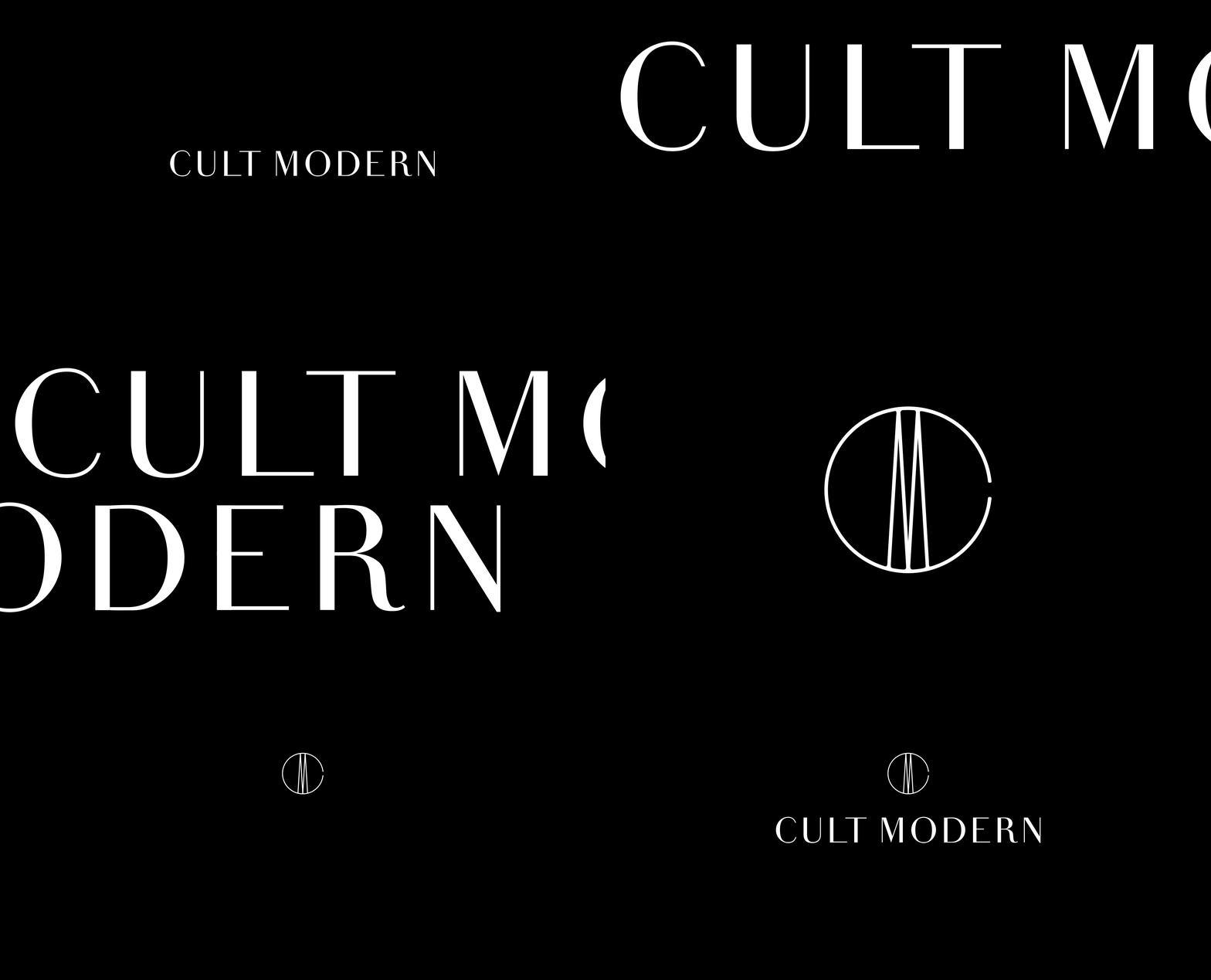
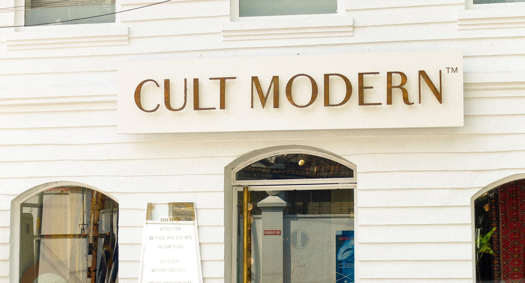
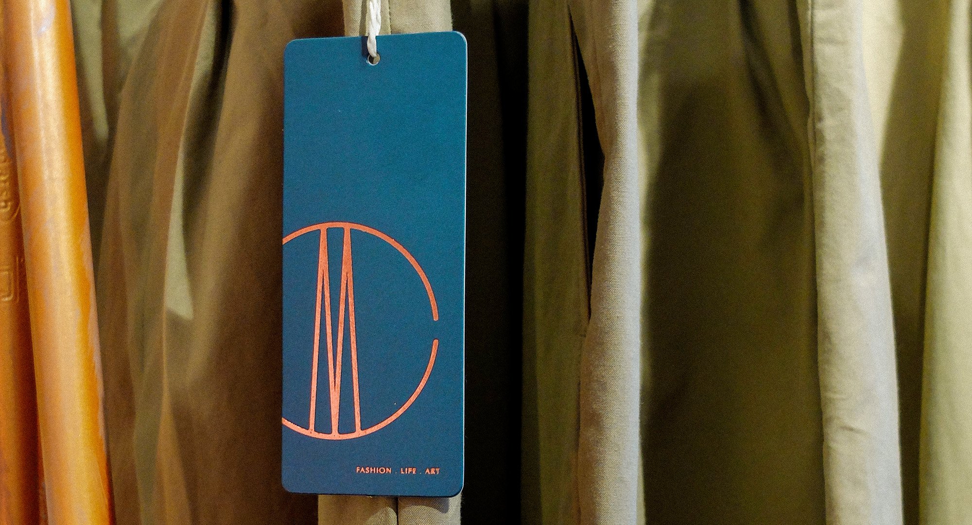
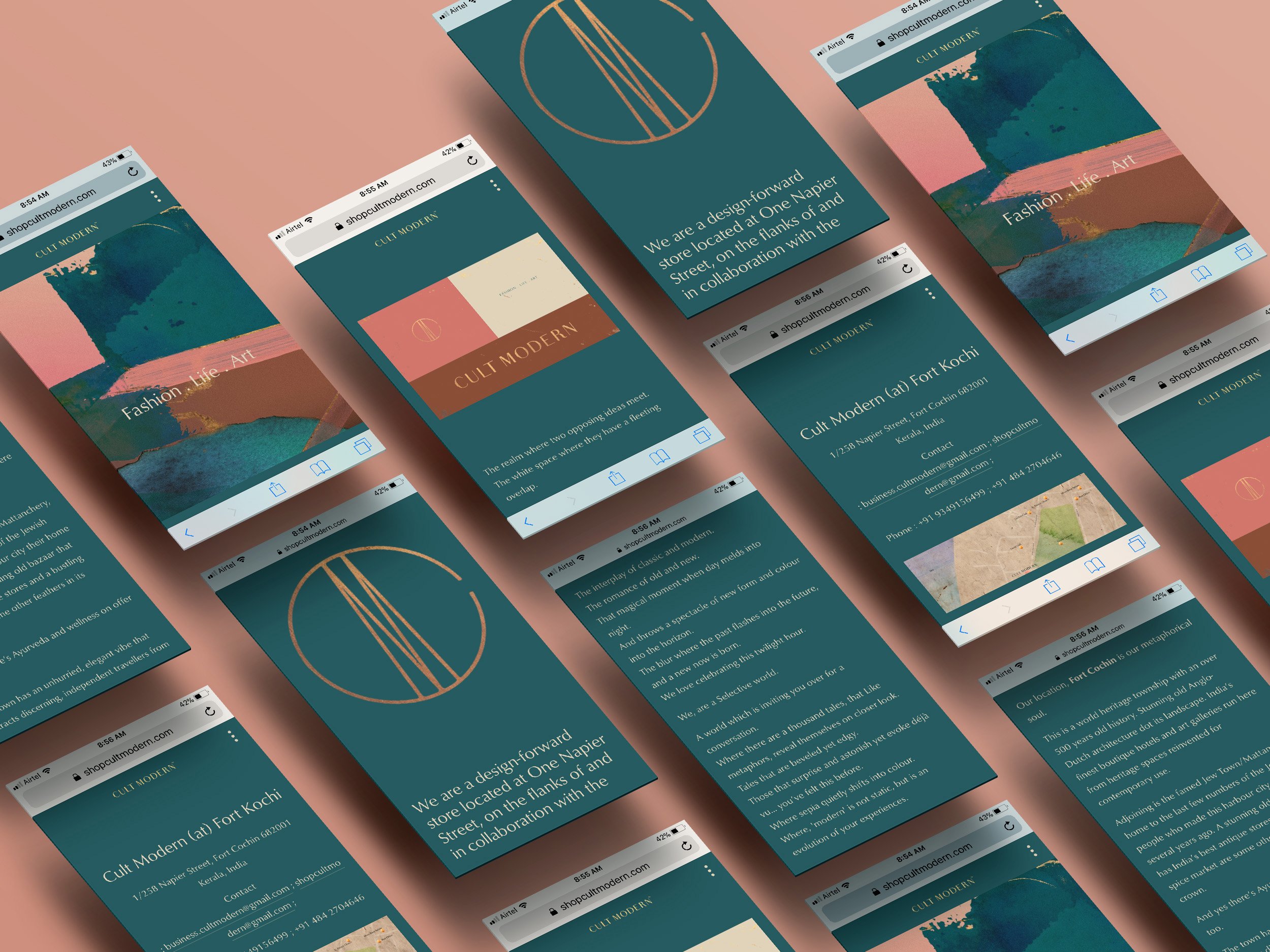
Crafting out the brand personality, brand values, brand essence, and how it gets translated across various offerings within the mother brand, we were able to bring alive this Twilight Zone. Even the typography has been created keeping in mind the evolution of type from classical to modern. We chose to be in between the classic, serif types and the bold, modern types. We have retained the modulated strokes, with varying stroke widths, that is reminiscent of the classical types, yet created a contemporary sans serif with just a bit of added curve for the R as he surprise factor. Sophisticated, classic and timeless, the custom typeface and insignia for the brand have been carefully crafted and detailed out.
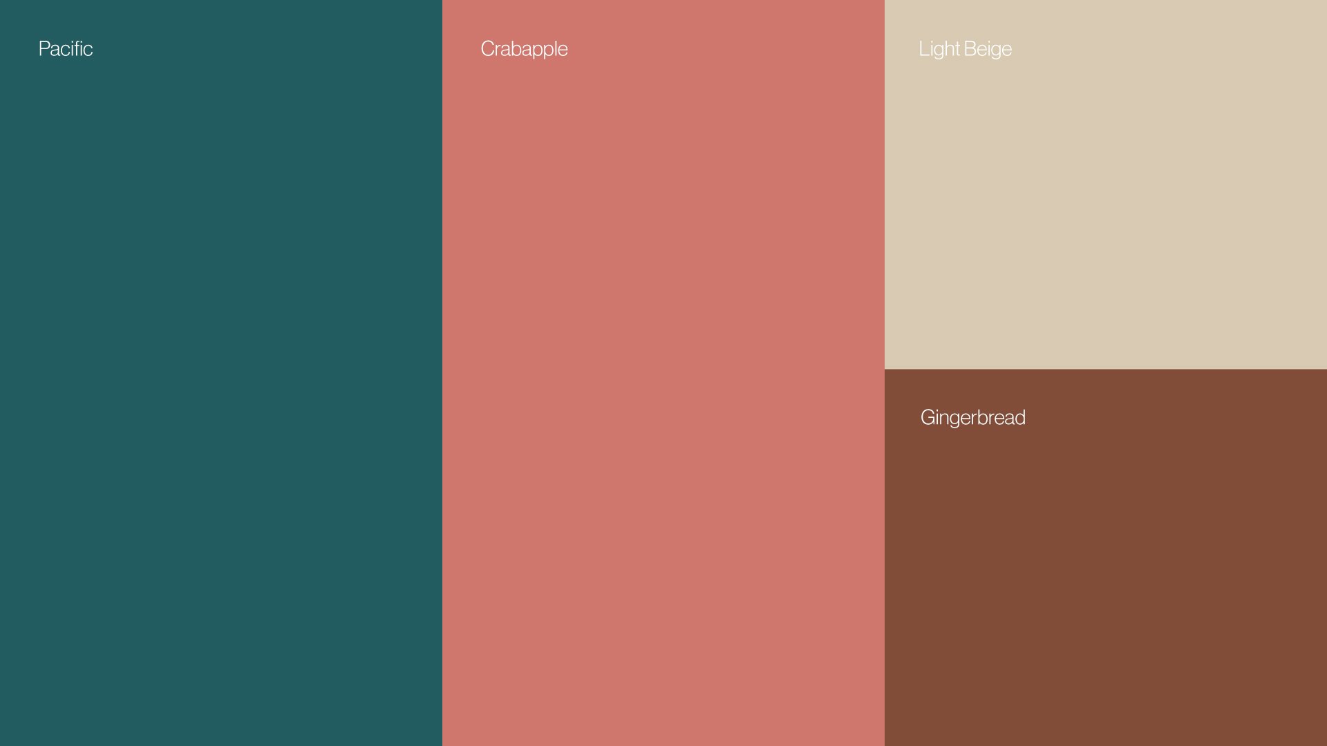
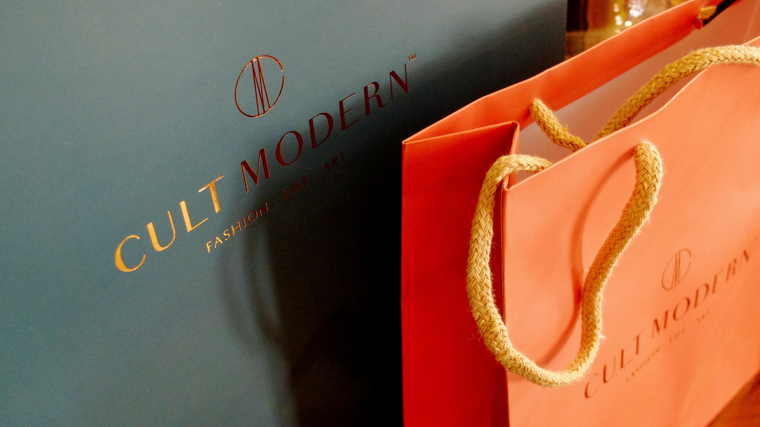
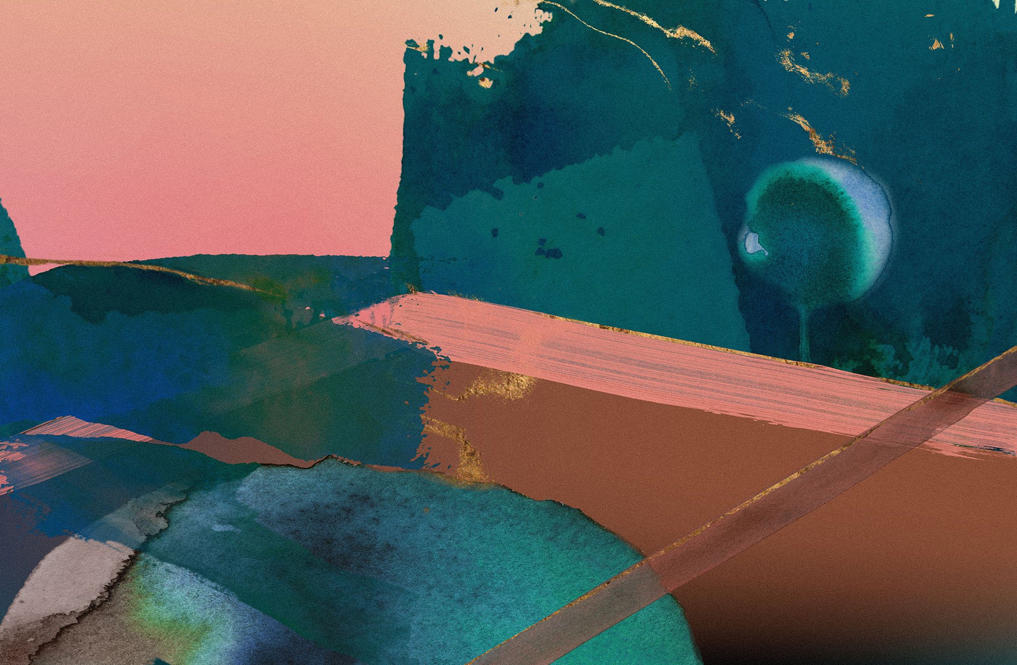
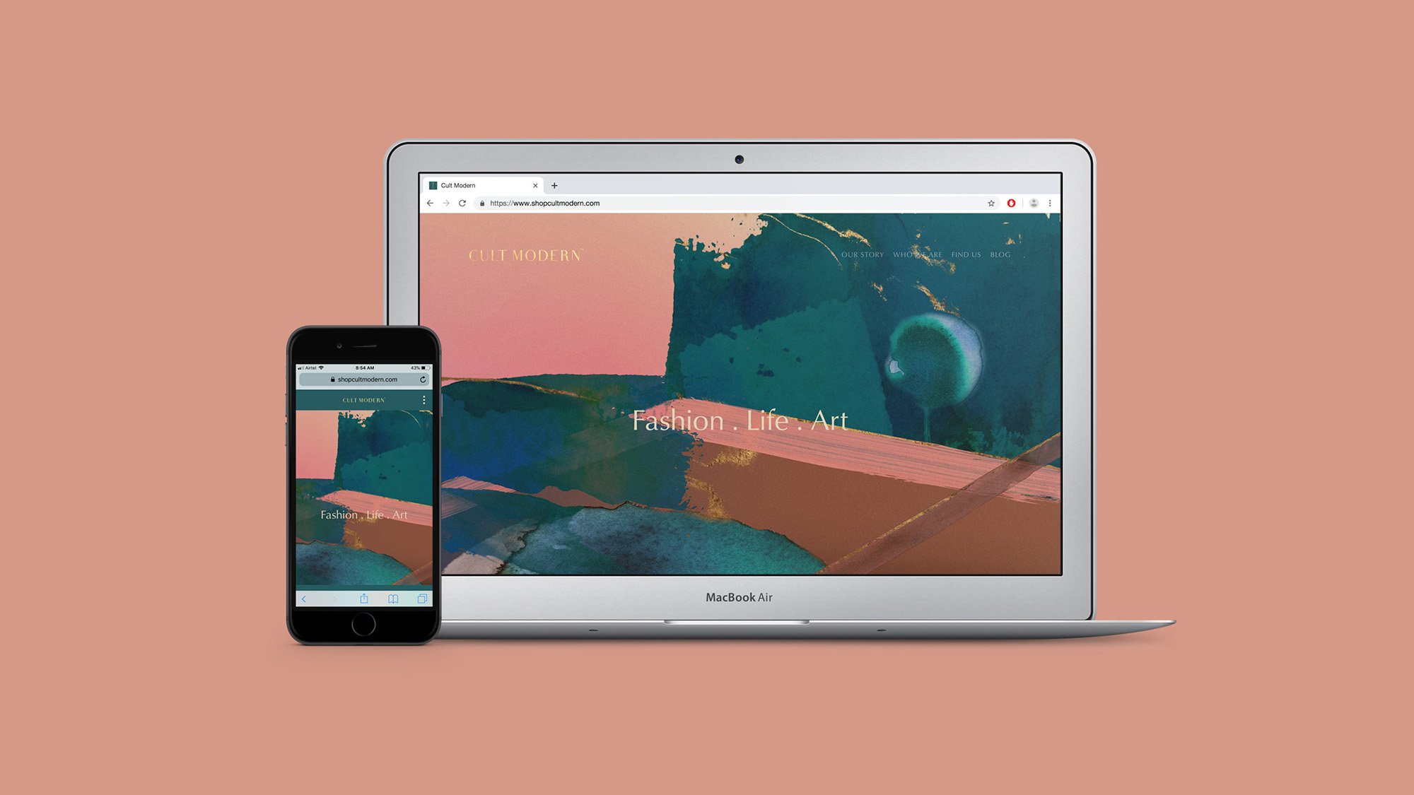
The Colour Palette for the brand is also an abstract take on the twilight zone, with the deep lush Pacific, the unexpected Crabapple, balanced by Light Beige and Gingerbread along with the accent colour of Aged Gold. It’s a colour palette inspired by a beautiful sunset - that takes you into the twilight zone.
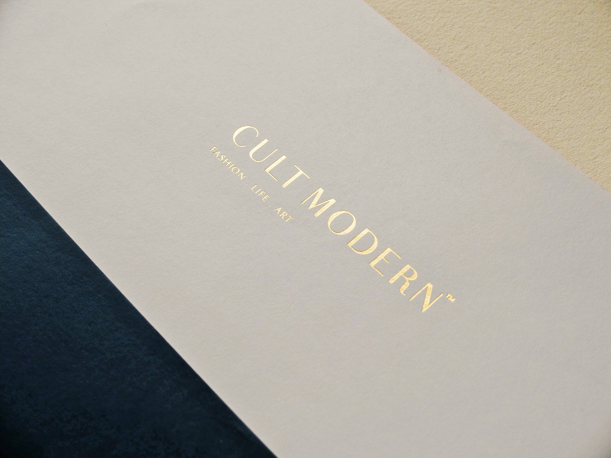
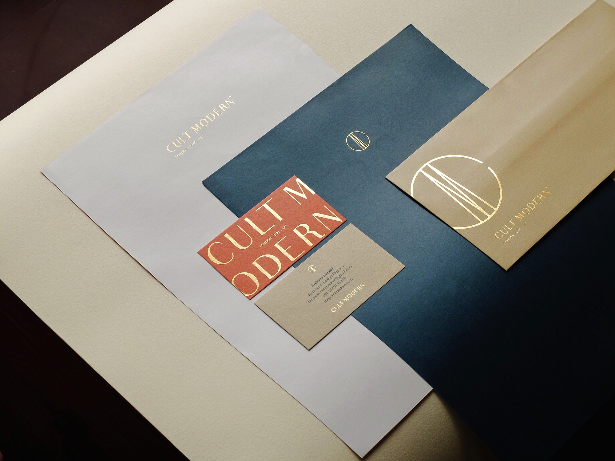
Business stationery, packaging collaterals, store signages and in-store colour applications were also carried out as a part of this exercise.
