Brand Identity & Packaging Refresh for Haeal
A number of strategic design decisions were taken for this health & beauty brand’s packaging & brand identity refresh. Being a brand that was already present in the regional market with very high visibility consumers had interacted with the brand at various touchpoints. We first spent time to understand what about the brand identity was working for them, what were the elements in the branding that had a high recall and association among the consumers’ minds. Realising that the leaf element was spontaneously recalled by almost all respondents, we decided that doing a complete identity change was not advisable. Hence we retained the key element recalled with tweaked and refreshed the typography.
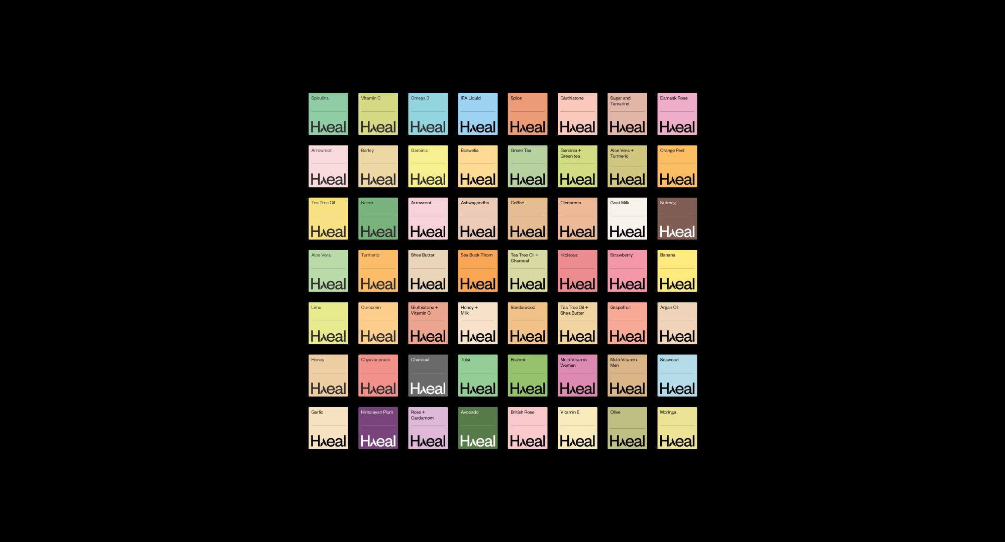
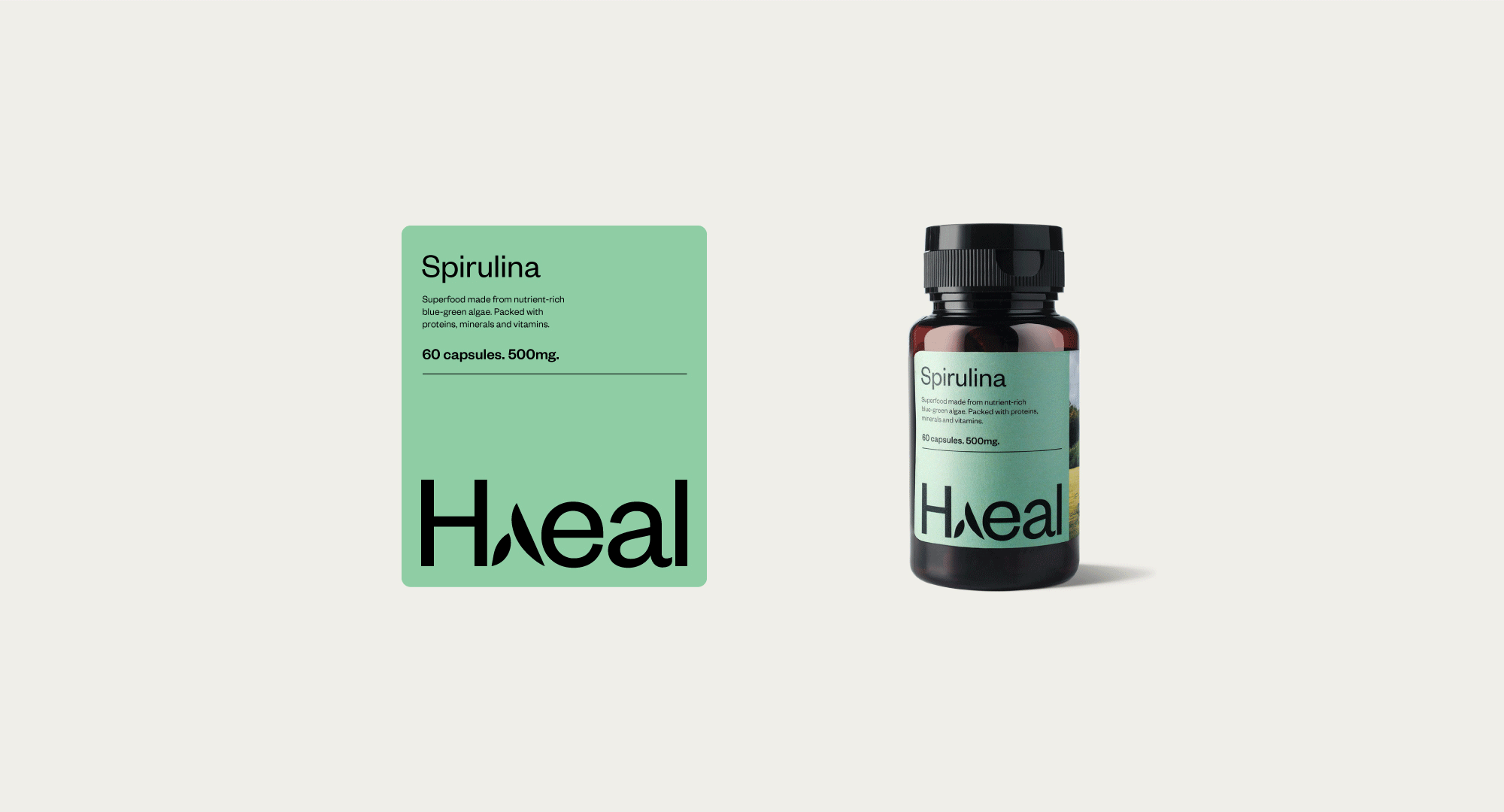
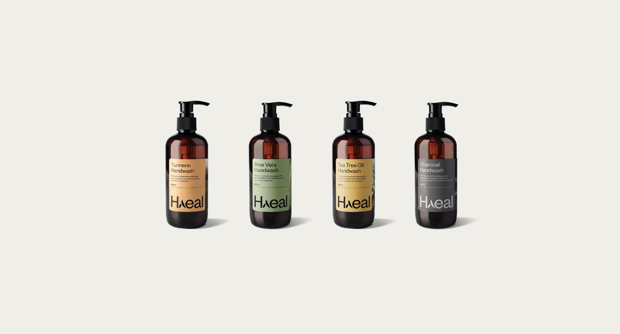
Through a category codes analysis, we identified broad clusters in the health & beauty space and mapped the same to Haeal’s brand strengths. From supplements to lotions, soaps and sanitisers, Haeal products are natural, clean and effective. There was a clear rationale on placing Haeal in a specific space within the category semiotics map. The design language also reflects the same values. Borrowing from the natural ingredients, we have kept a clean minimal look across the range of products, connoting a no-frills, matter-of-fact approach.


The next exercise was to crack a design template that was broad enough to accommodate the existing and possible future variants, yet was tight enough to create a unifying umbrella design language. A clean and clear variant architecture and design template was crafted that has been taken forward by the brand even after many further new launches and extensions.
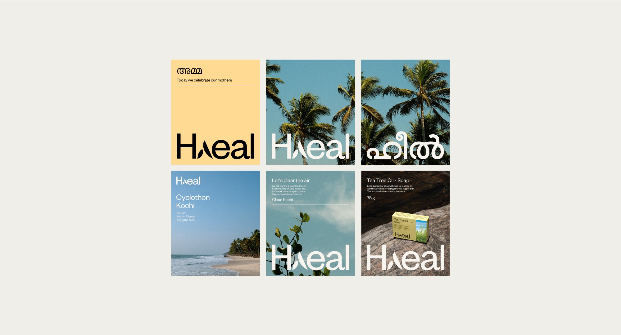
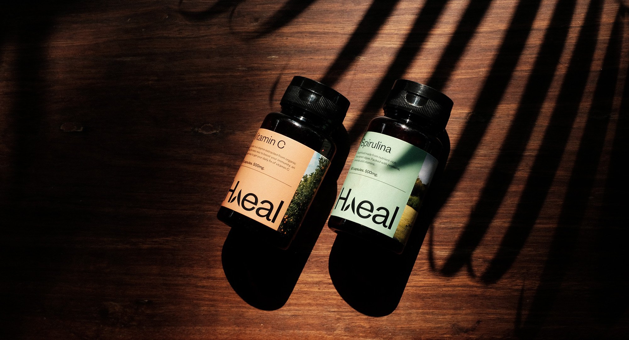
Keeping in line with the vision for the new visual identity for Haeal, there was a decision to change the bottles from clear transparent bottles to amber transparent bottles. Ingredient based variant colour coding was adopted, a distinct brand typography was selected, and a brand imagery that was inspired by the origin stories of Haeal was decided upon to highlight nature, tropical sun & lighting, and a clear story for each variant and for Haeal as a whole. The brand imagery, like the brand Haeal - is clean, natural and proud of its origin story.
The newly launched Haeal packaging was photographed across natural landscapes staying true to the brand identity guidelines. The new brand identity sure did increase the brand perception as ‘a modern, international, effective brand.’