Haeal Life - Portfolio Architecture, Strategy, Naming & Identity Creation
A while ago, we worked on the brand identify for Haeal. This time we were tasked with a much more comprehensive project - to craft the strategic approach for the parent brand - the House of Brands, within which Haeal would now exist. This parent brand has a range of products across different categories, catering to the needs of different target audiences across ages and life stages. From nature based soaps to ayurvedic tonics, floor cleaners to dish washers, baby oils to dog shampoos, this parent brand has something for everyone.
How do we make sense of 15+ brands across segments? What is the logic behind the portfolio architecture? Which is the hero brand? What do we borrow from the hero offering and how does that manifest in a larger corporate brand and brand name? These were some of the points we addressed. We did an exhaustive exercise to understand each brand, to cluster these into different groups, made recommendations on short term brand tasks and longer term brand tasks - clubbing some offerings, differentiating some offerings, following an endorser brand approach for some, taking a standalone brand approach for others, making cases to retain some existing brands as separate brands and deciding on a portfolio architecture framework for potential future acquisitions.
We followed an approach where the name of one of the key brands in the house of brands, is also part of the parent brand name. Given the high brand recall, trust and credibility around brand Haeal, it was quite logical to retain the name Haeal even in the Parent Brand Name. While studying various such parent band names, we got the feedback that many of those sounded too ‘corporate’. We wanted the parent brand name to be approachable, warm and relatable; definitely not cold, stand-offish or intimidating. Going with the world and the tone of voice that we wanted to craft for the parent brand, we chose the name Haeal Life.


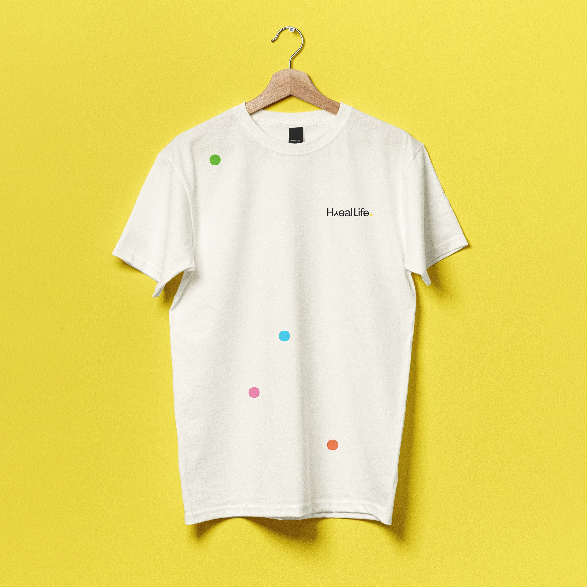
The Haeal Life logo uses the visual elements from the hero brand Haeal’s logo, in order to capitalise on brand Haeal’s goodwill and recall among the customers. This was in line with the House of Brands Strategy that was finalised during the stakeholder sessions. The additional element was the word Life (chosen as it gave a warm and approachable vibe to the house of brands) and the yellow dot (which is the distinct icon for this House of Brands entity). Corporate branding elements like employee hampers, tote bags, notebooks, pens, water bottles, tshirts, ID card and more were designed using the brand identity elements.


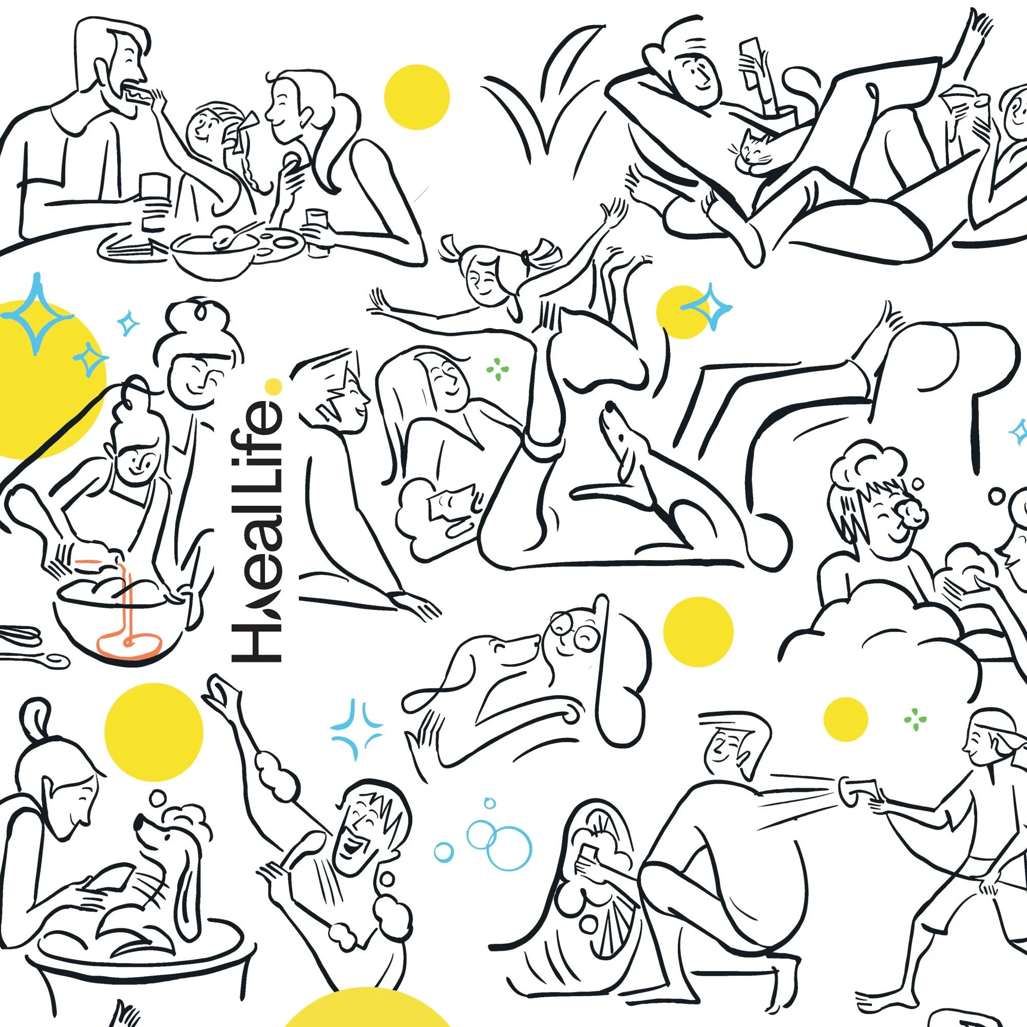
The Versatile Yellow Dot: The yellow dot in the Haeal Life identity symbolises the sun, the warmth, the energy, the fuzzy feeling of a happy wholesome famiy. The dot is seen as a versatile unit that can be used in varying sizes according to usage in graphic design and motion design. It is a constant reminder of the brand philosophy. It is the always on message from the brand - that there is a need to spread some sunshine in everyone’s lives.


Brand Illustration: A lighthearted style of illustration was chosen for the fuzzy world and the ‘always cheerful’ tone of voice of Haeal Life. The squeaky clean floors, dishes, clothes, cars, pets, people… and the happy fun world of theirs has been shown in a set of illustrations, that bring alive the thought of Haeal Life ‘spreading sunshine into peoples’ lives’.