Branding for Terratone Boutique Business Hotel
Kollam/Quilon, the renowned port city in Kerala sees the arrival of a new boutique business hotel, all set to redefine business accommodation in the region. Synonymous with spice trade, known as the cashew capital of the world, situated along the banks of the Ashtamudi Lake, serving as the southern gateway to the backwaters, Kollam is unassuming at first look yet strong in business ambitions.
With sustainable, modern architecture; rich, earthy tones; grounded, warm approach; and a pioneering spirit; this boutique business hotel is truly ushering in a new era of business hospitality in Kollam.

We were approached by the founders to set the ball rolling - defining the approach, the positioning, the identity, the tone, the SOPs, and to ensure the spirit of the founder’s vision and architectural philosophies were carried forward in the intangibles of the brand world.
Our journey began with a visit to the hotel site, at that time still under construction, but definitely giving a peek into the beauty it would bloom into. We had a warm and open conversation with the founders, asking questions and digging deeper to understand the unsaid aspects - the reason to venture into this sector, the genuine desire to offer a new experience, the belief in ensuring a better than expected experience, the warmth and hospitable nature that was the essence of who they are as people. This was followed by consumer conversations where we got to hear stories of business travel, what bothered them during such trips, what they missed, what made them feel cared for, and what they returned to again and again. We mapped the competition and looked at what was missing in this category and then tried to weave the story of this brand.
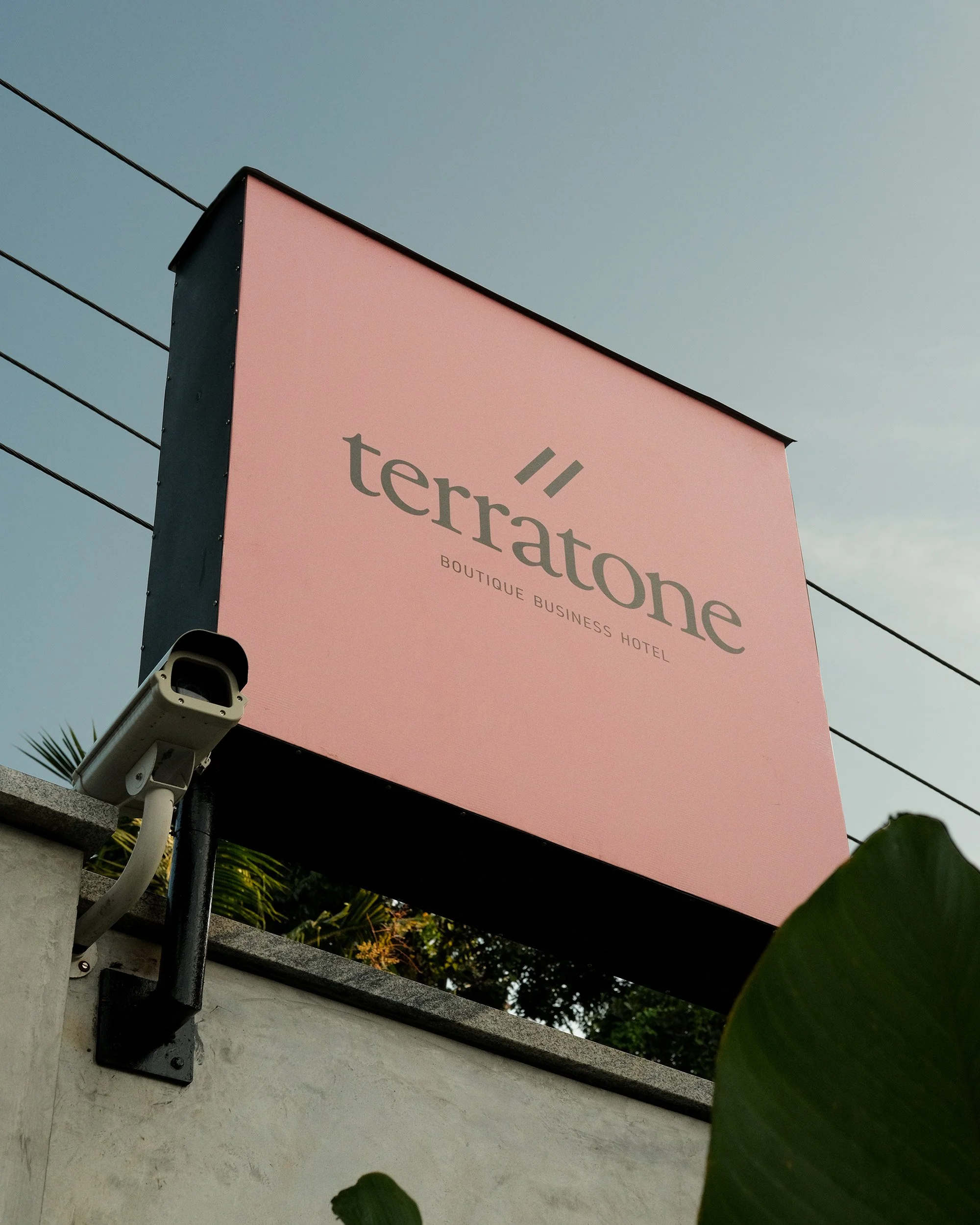
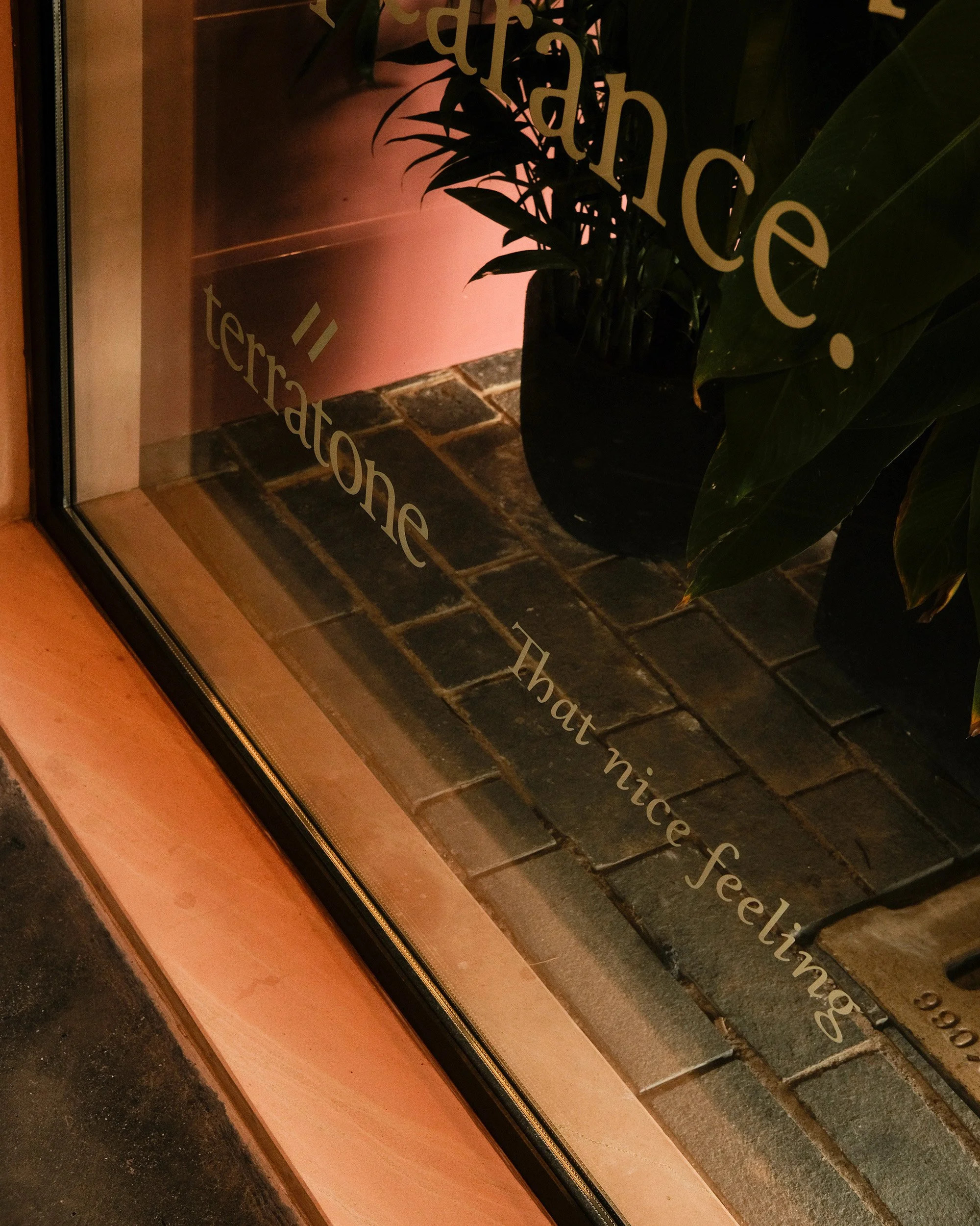
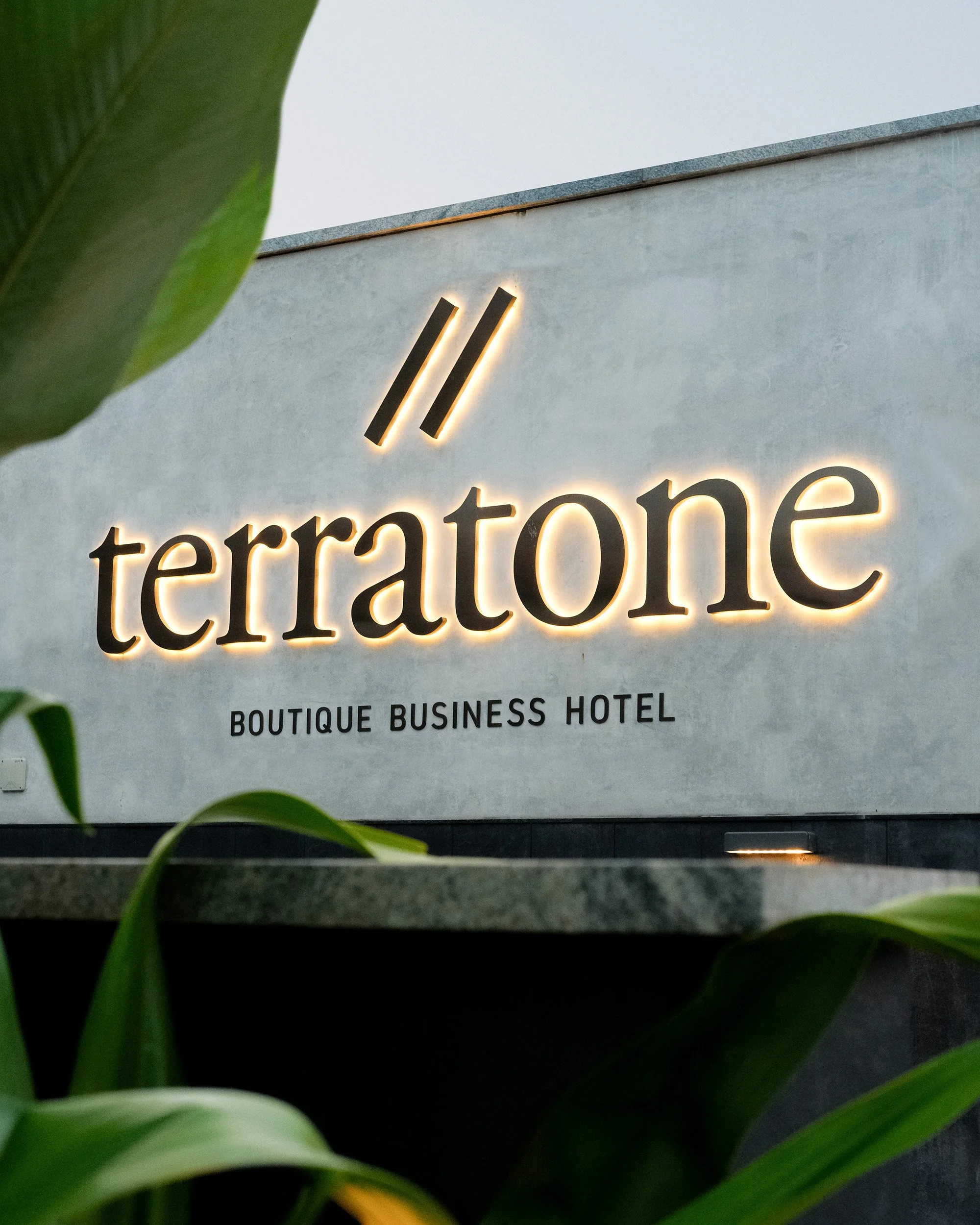
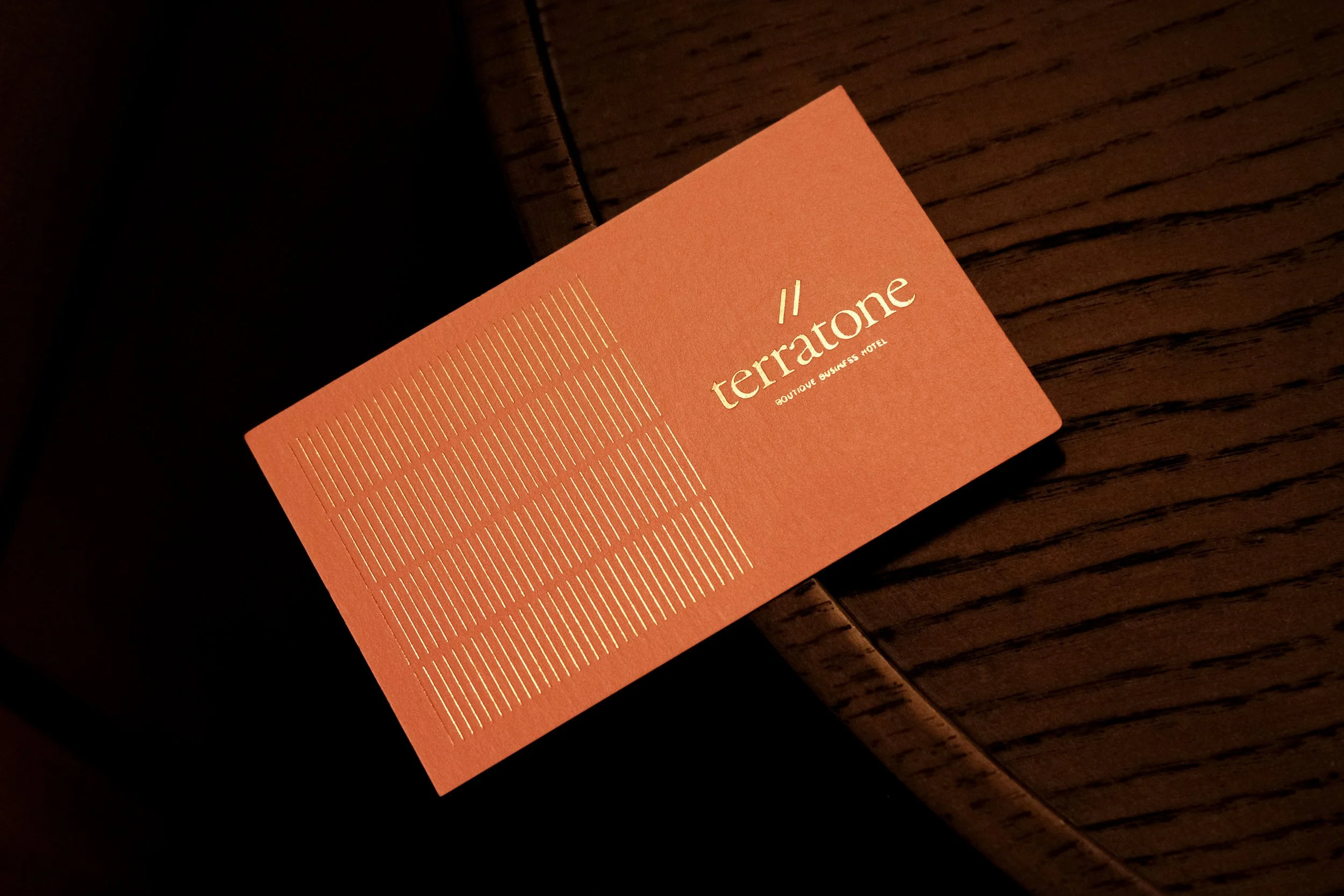
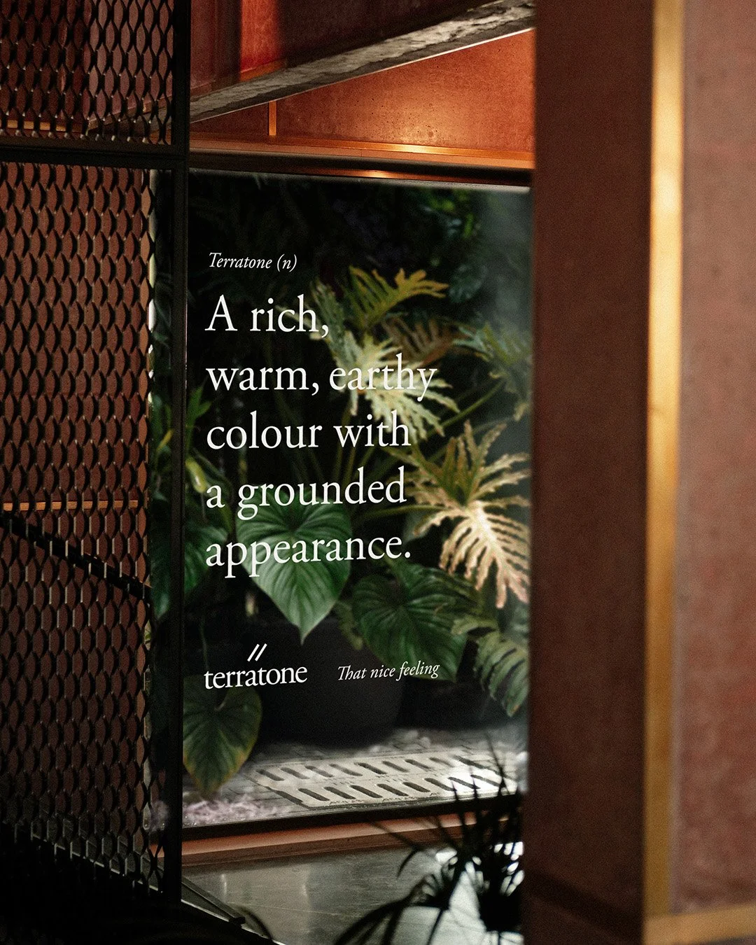
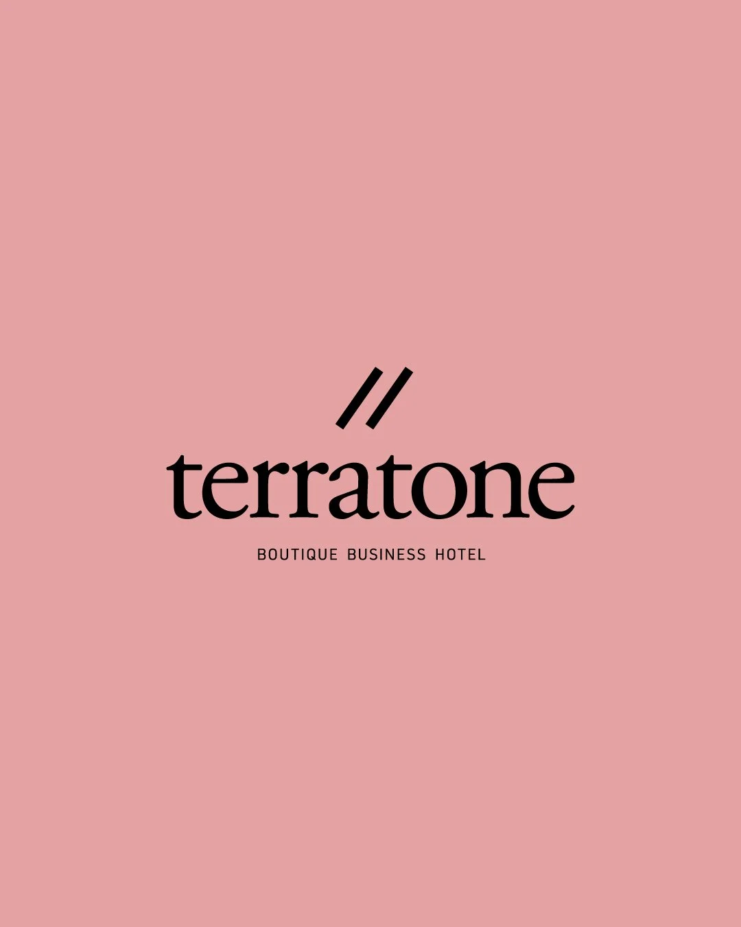
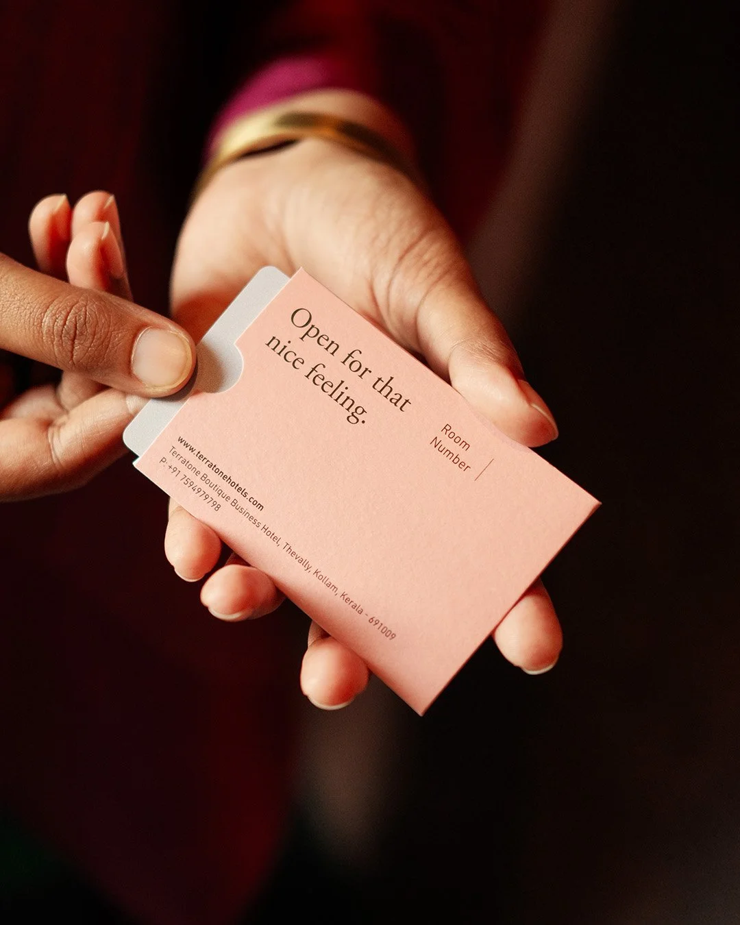
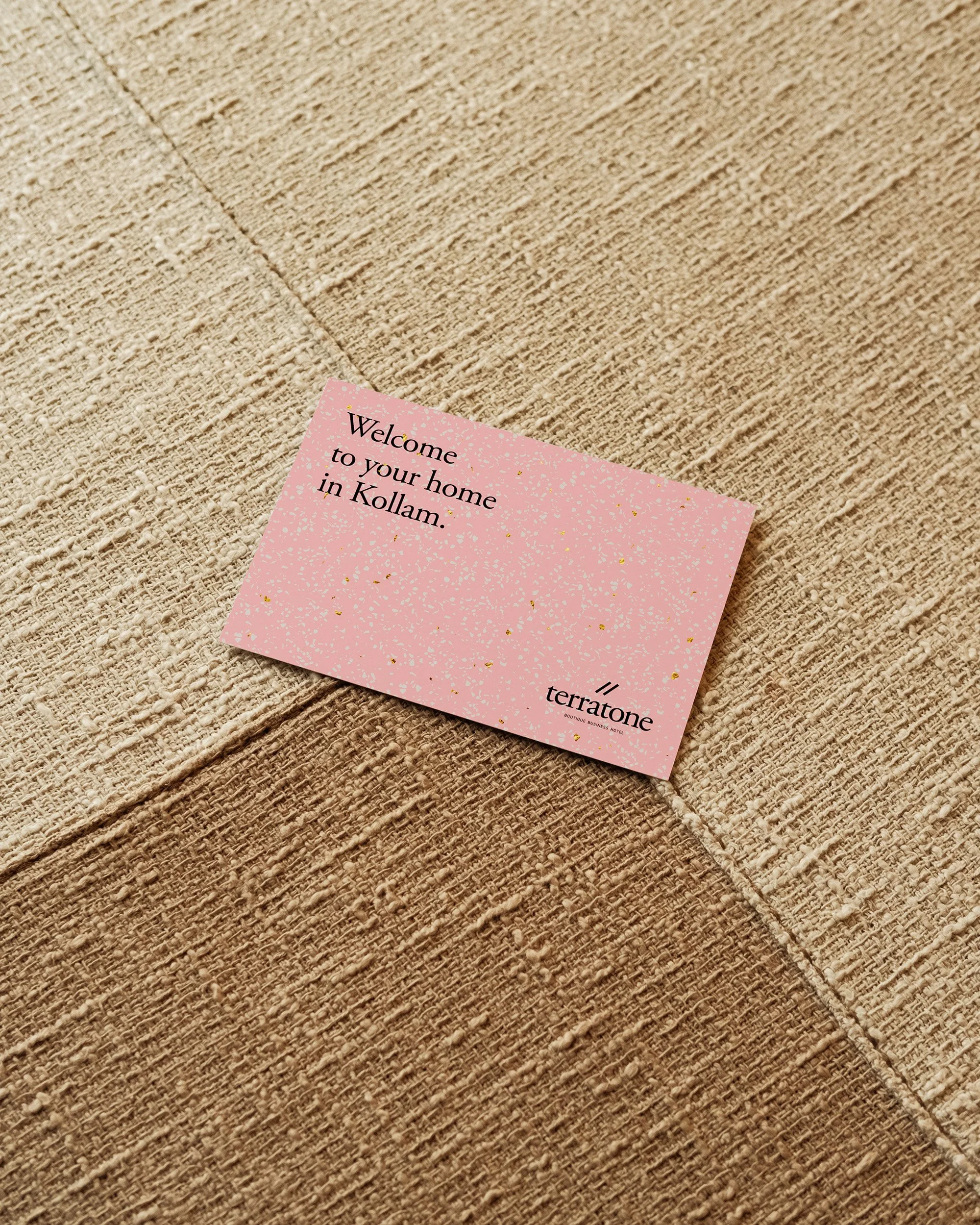
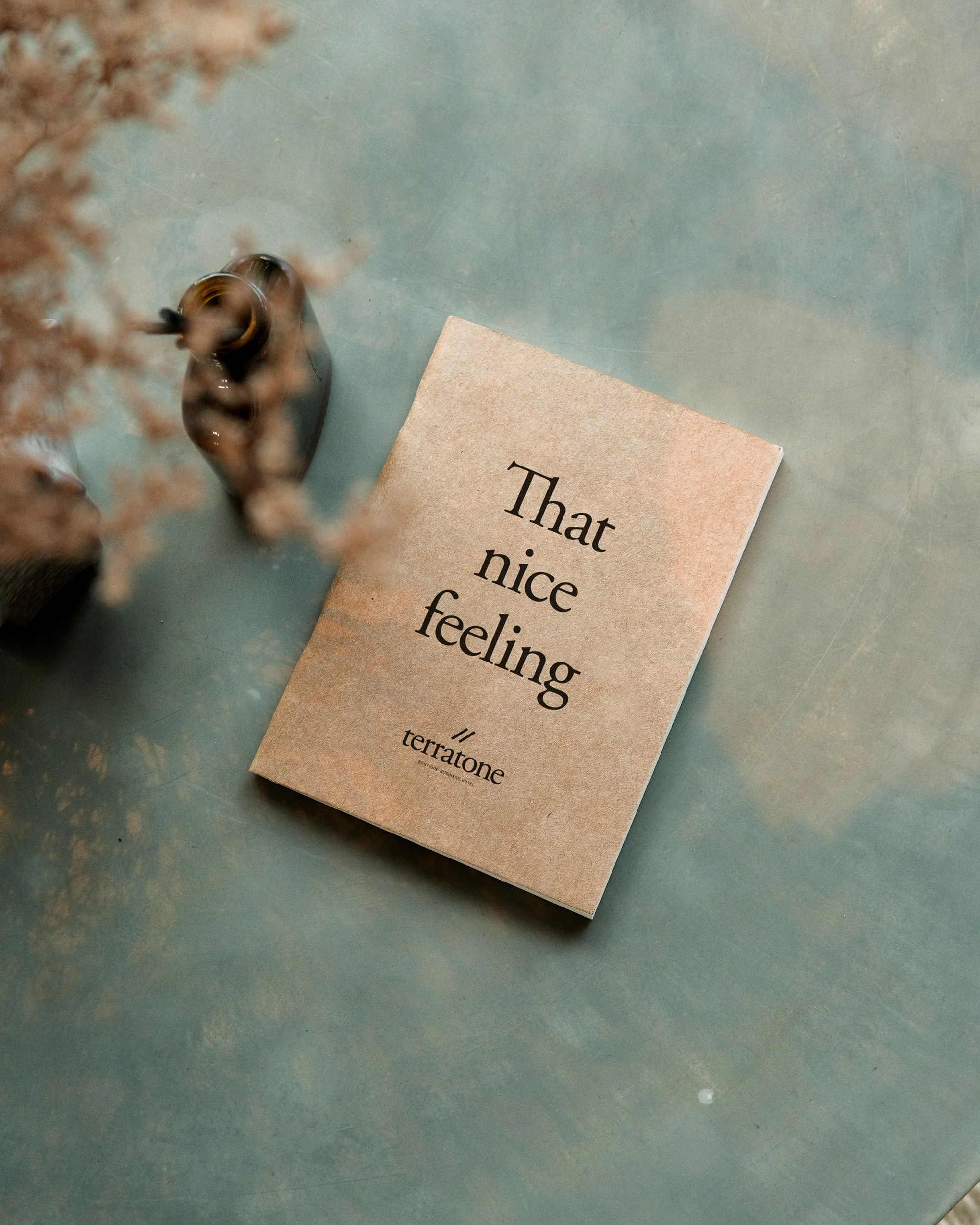
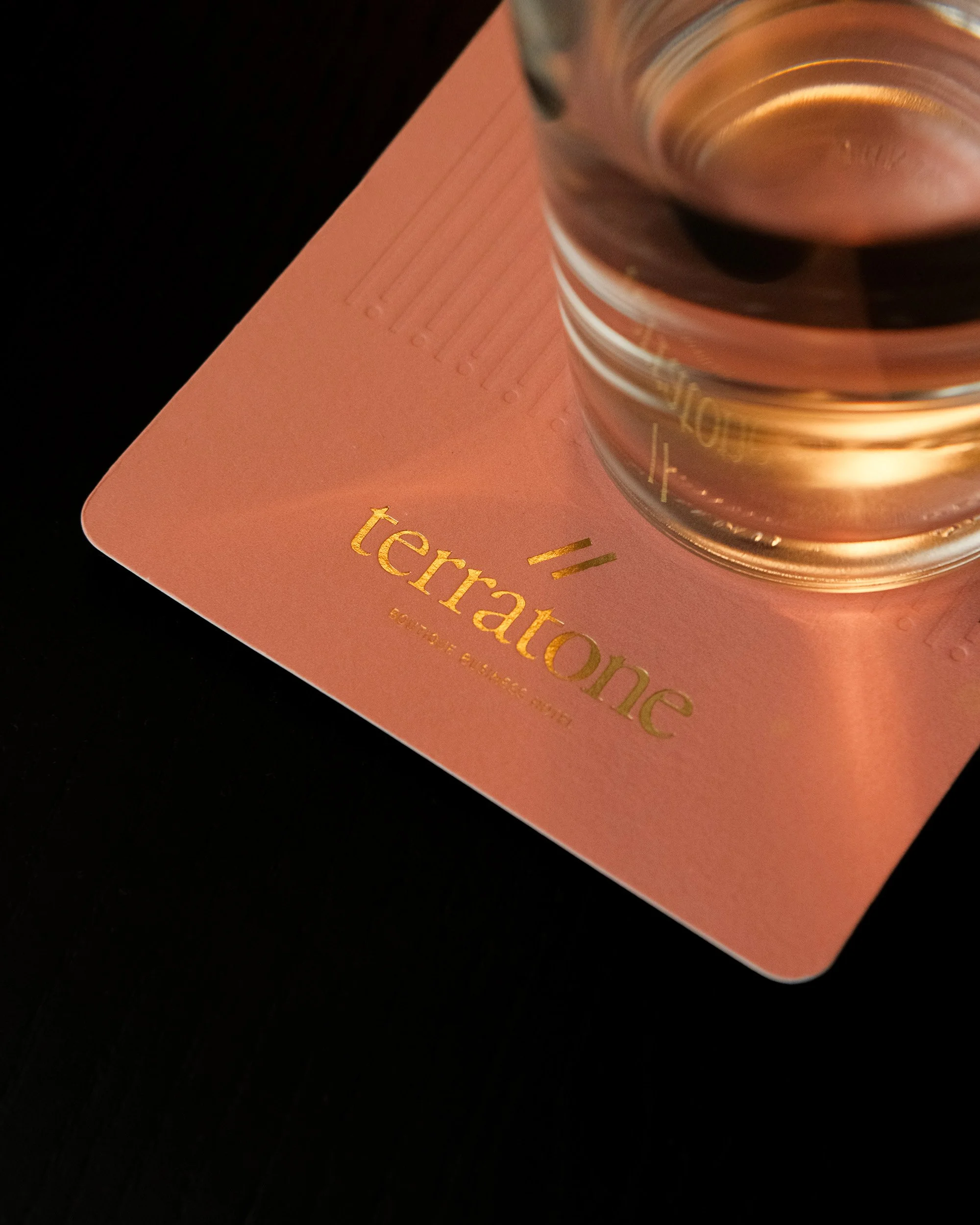
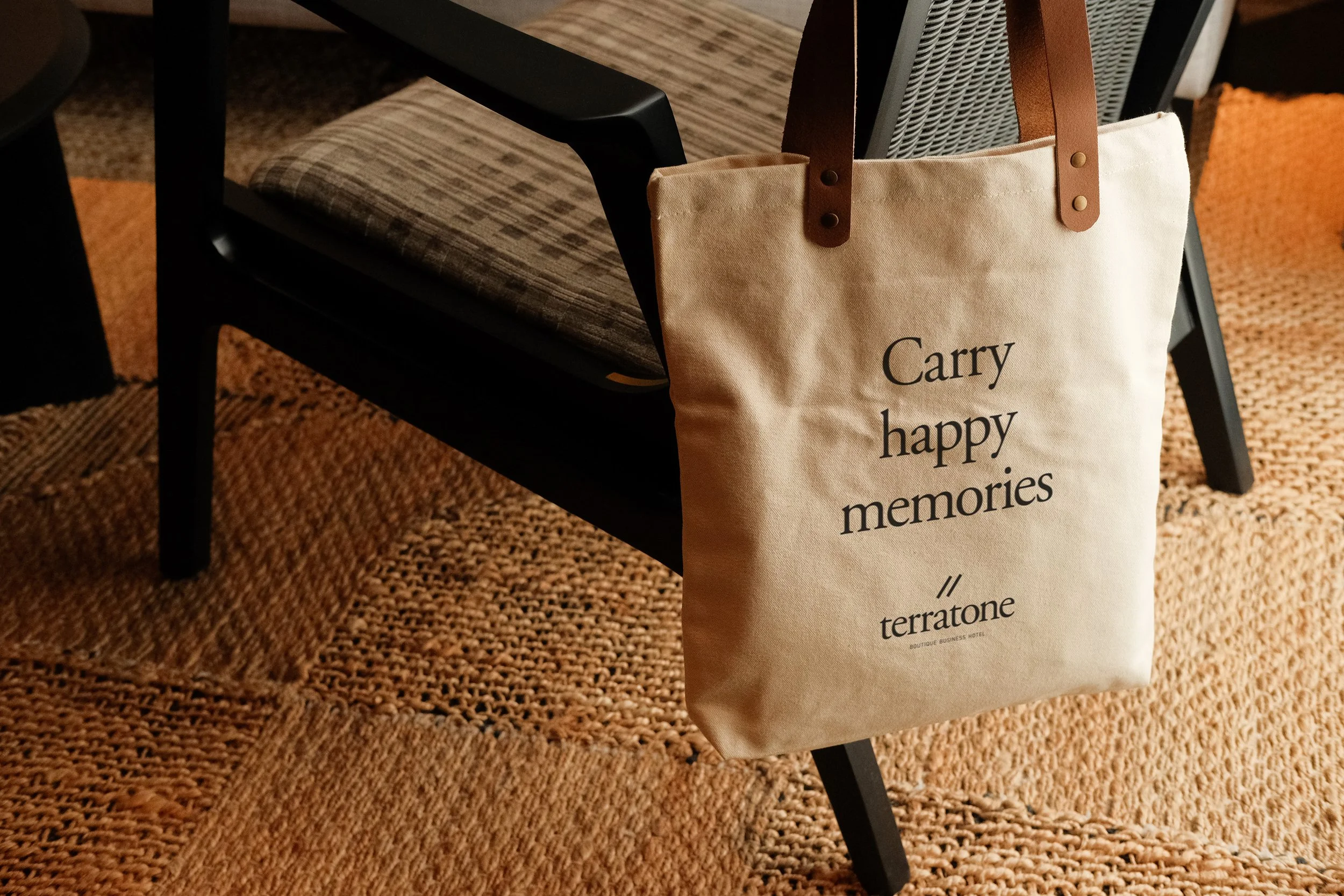
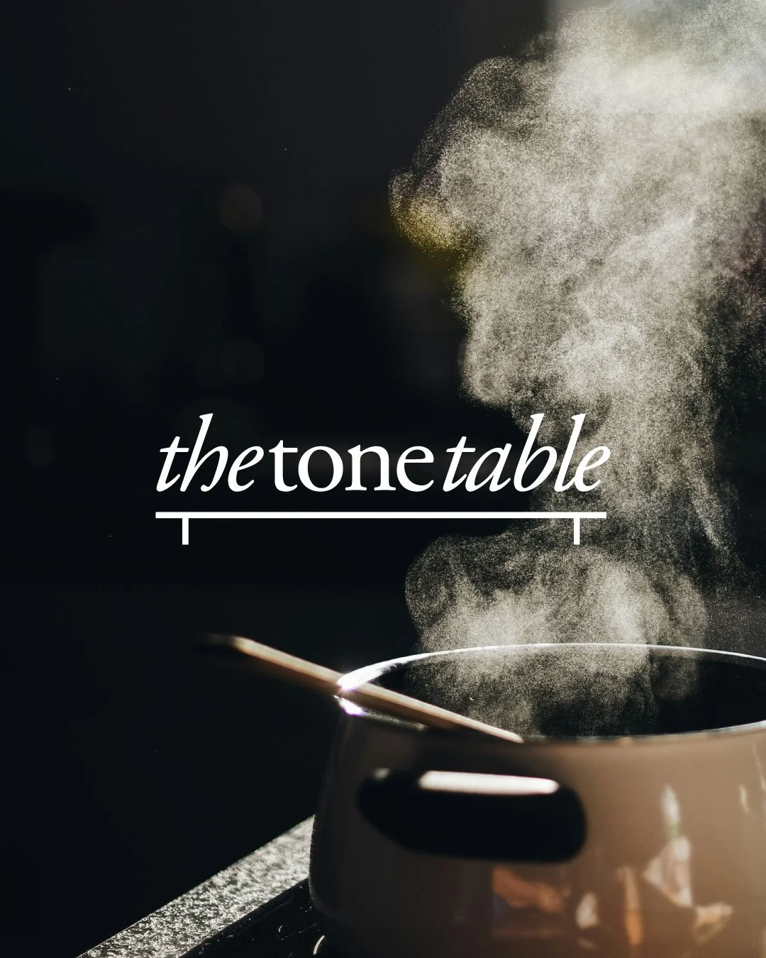
Born from the philosophy and beliefs of the founders, this brand is one that is grounded, rooted in strong values and centred on warmth and hospitality. Architecturally it was envisioned as a one of a kind building, truly sustainable, with earthy colours, exposed textures, natural finishes and soothing tones. The name Terratone captures the essence of the brand - the philosophy of the hotel and the physiology of the building. This boutique business hotel intends to bring together the efficiency of a business hotel and the intimacy of a boutique hotel - adding a touch of warmth to rejuvenate the business travellers during their pit stop at this hotel. This is a pause before they restart their journeys and their busy schedules. A pause to refresh and reset. // The Caesura Symbol // - the two diagonal lines - indicate a pause, to catch one’s breath, before they continue their business travel. The verbal identity captures ‘That Nice Feeling’ when one checks in and stays at this hotel.
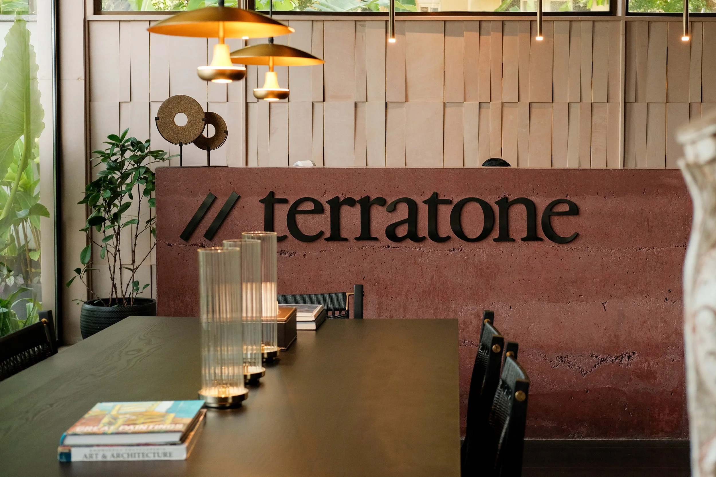
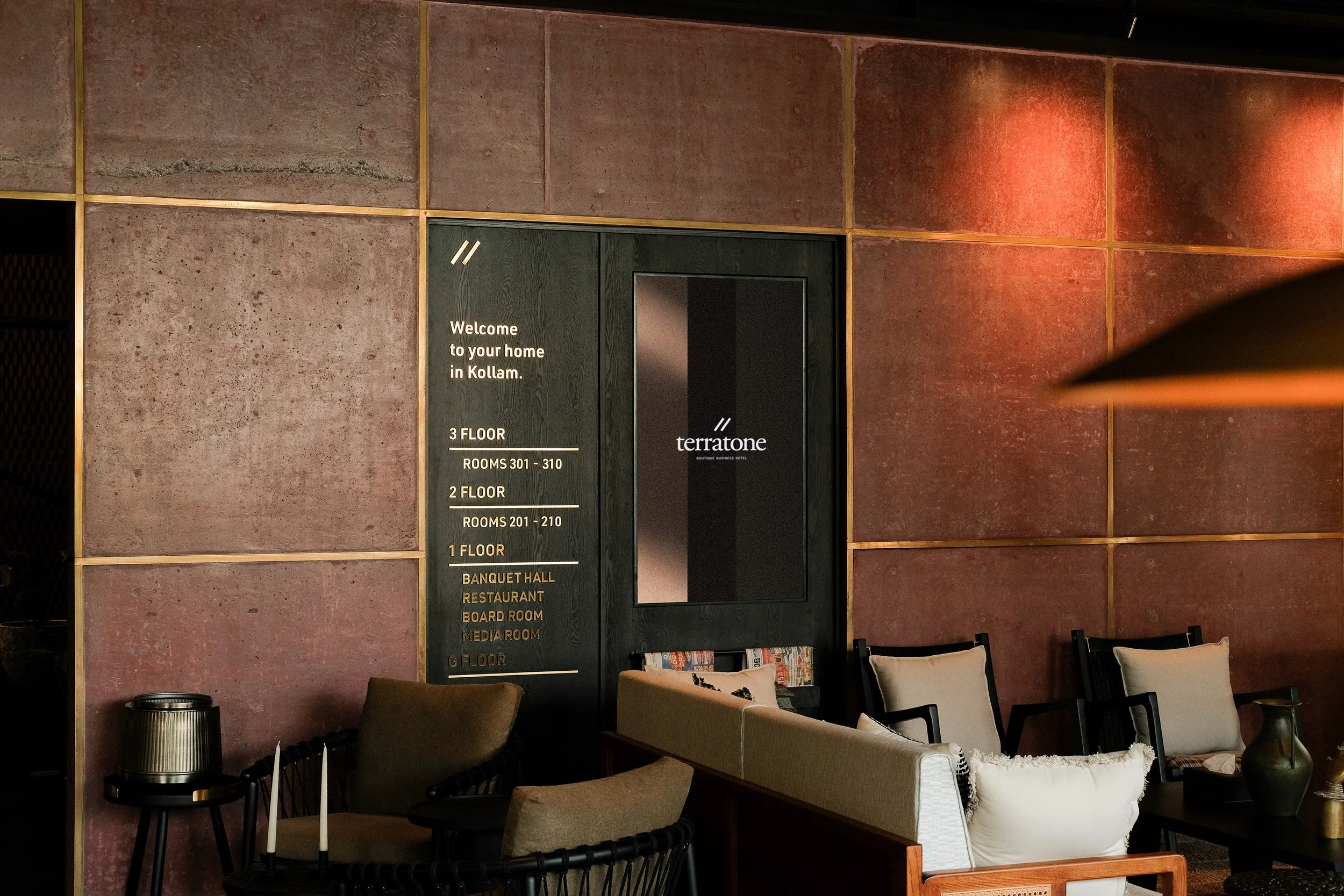
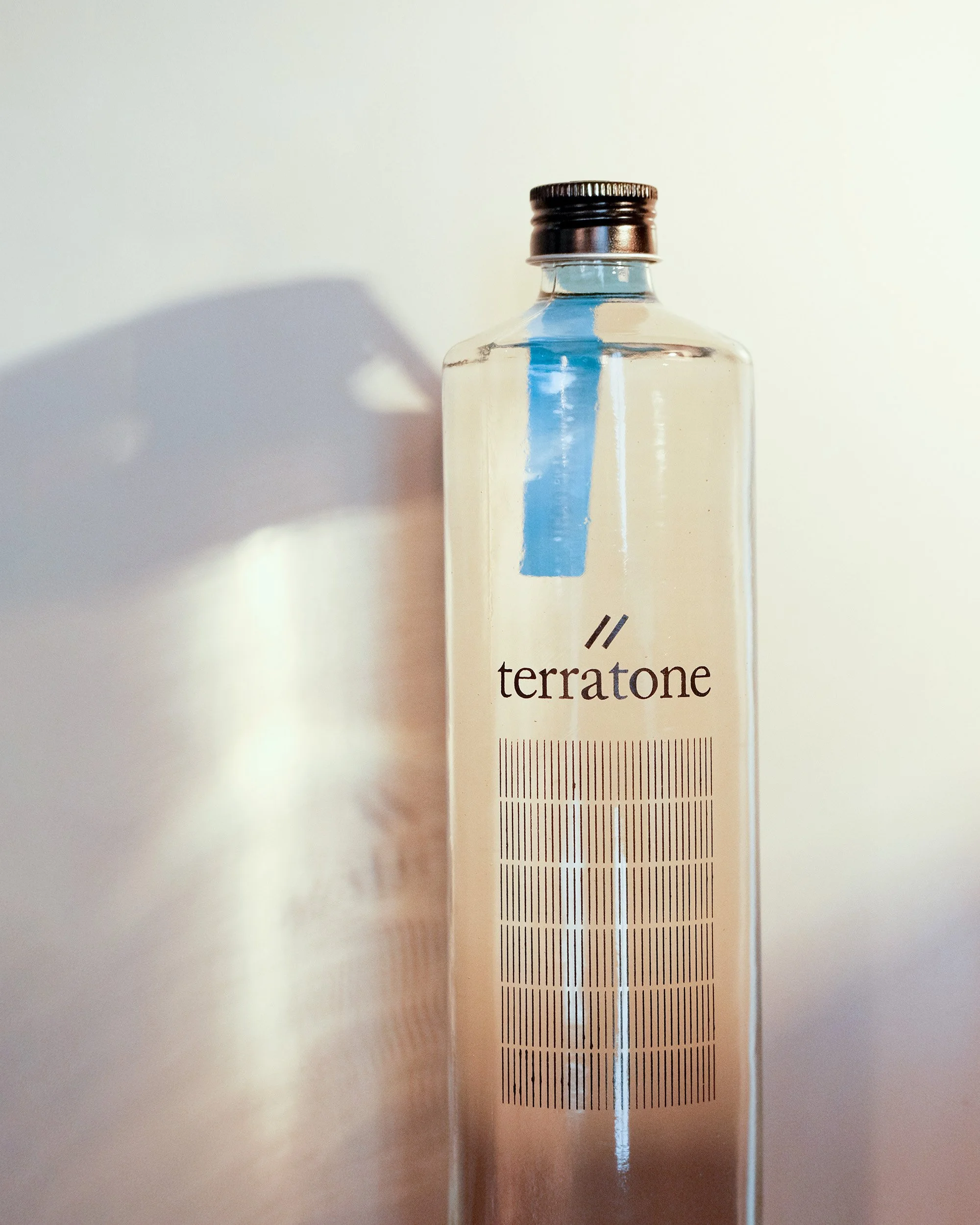
The Brand Colour Palette captures the warmth and philosophy of ‘Terratone’. Inspired by patterns embedded in the architecture of this boutique hotel, a set of graphic design elements were crafted. Along with the brand insignia (symbolising the pause to reset), the logotype, the brand colour palette, the brand typography, these brand motifs complete the visual design language of this hotel brand.


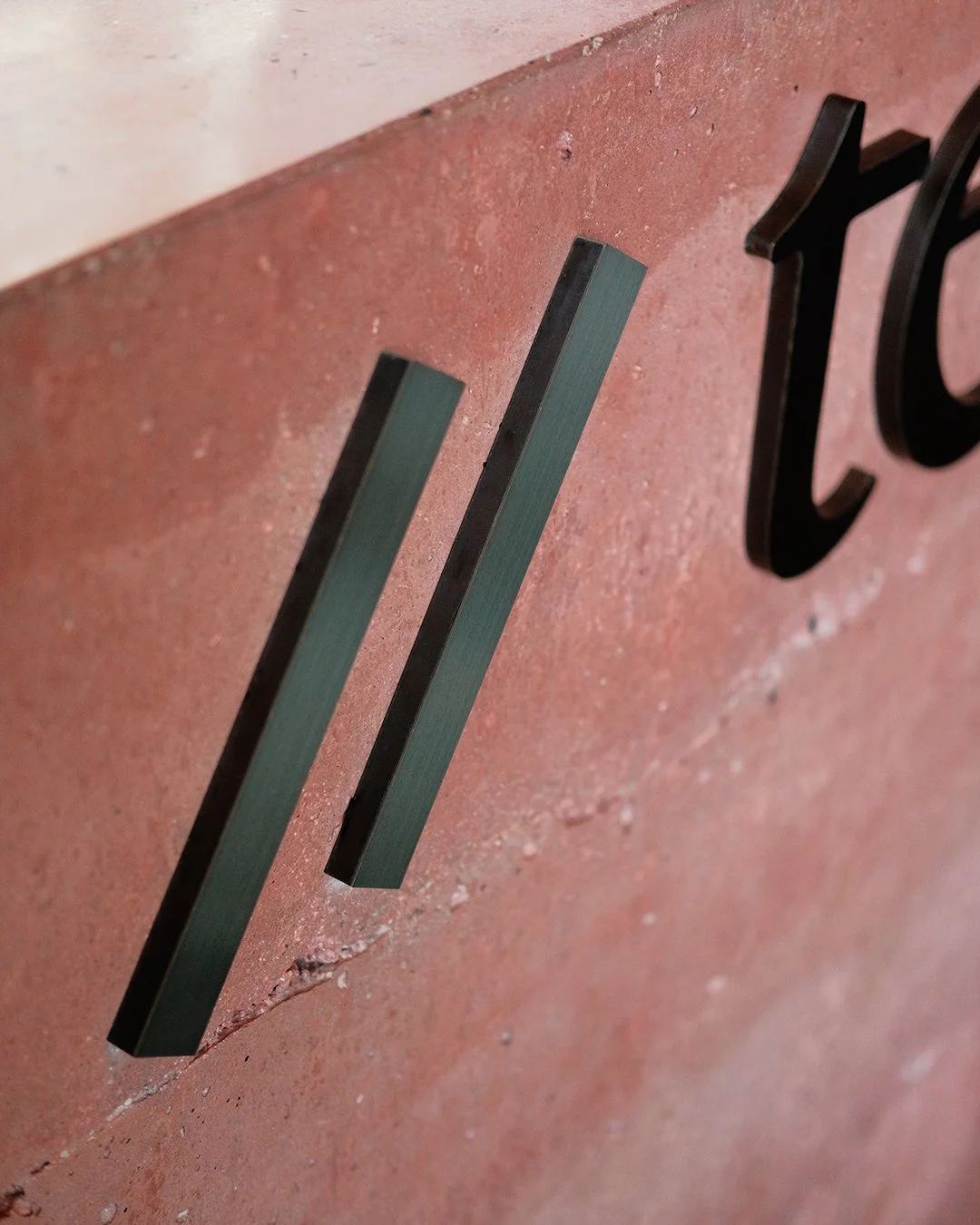
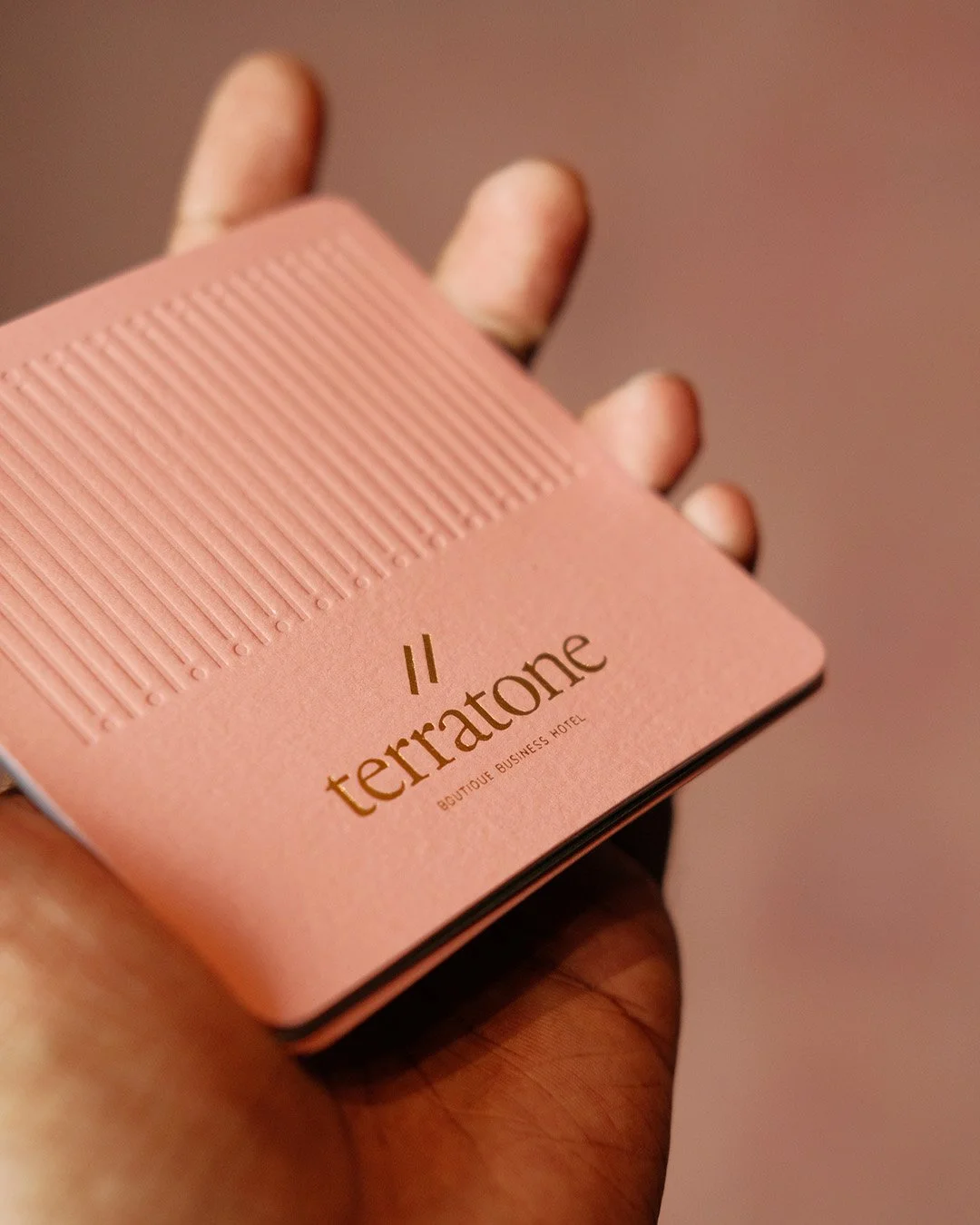
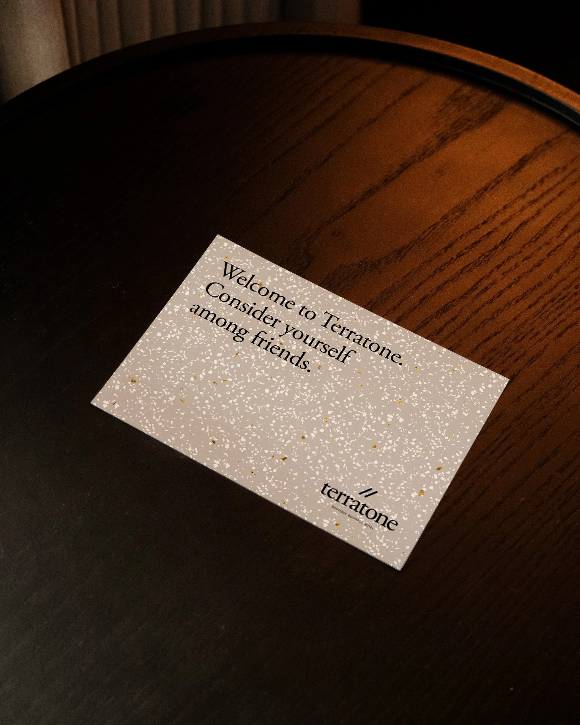
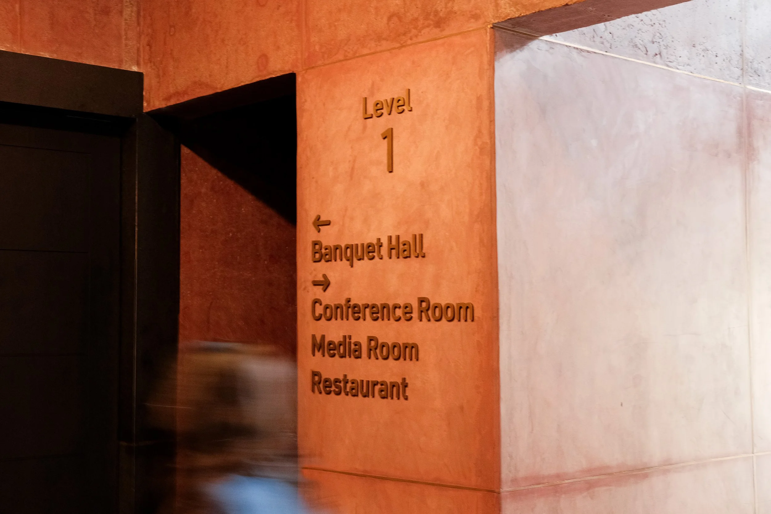
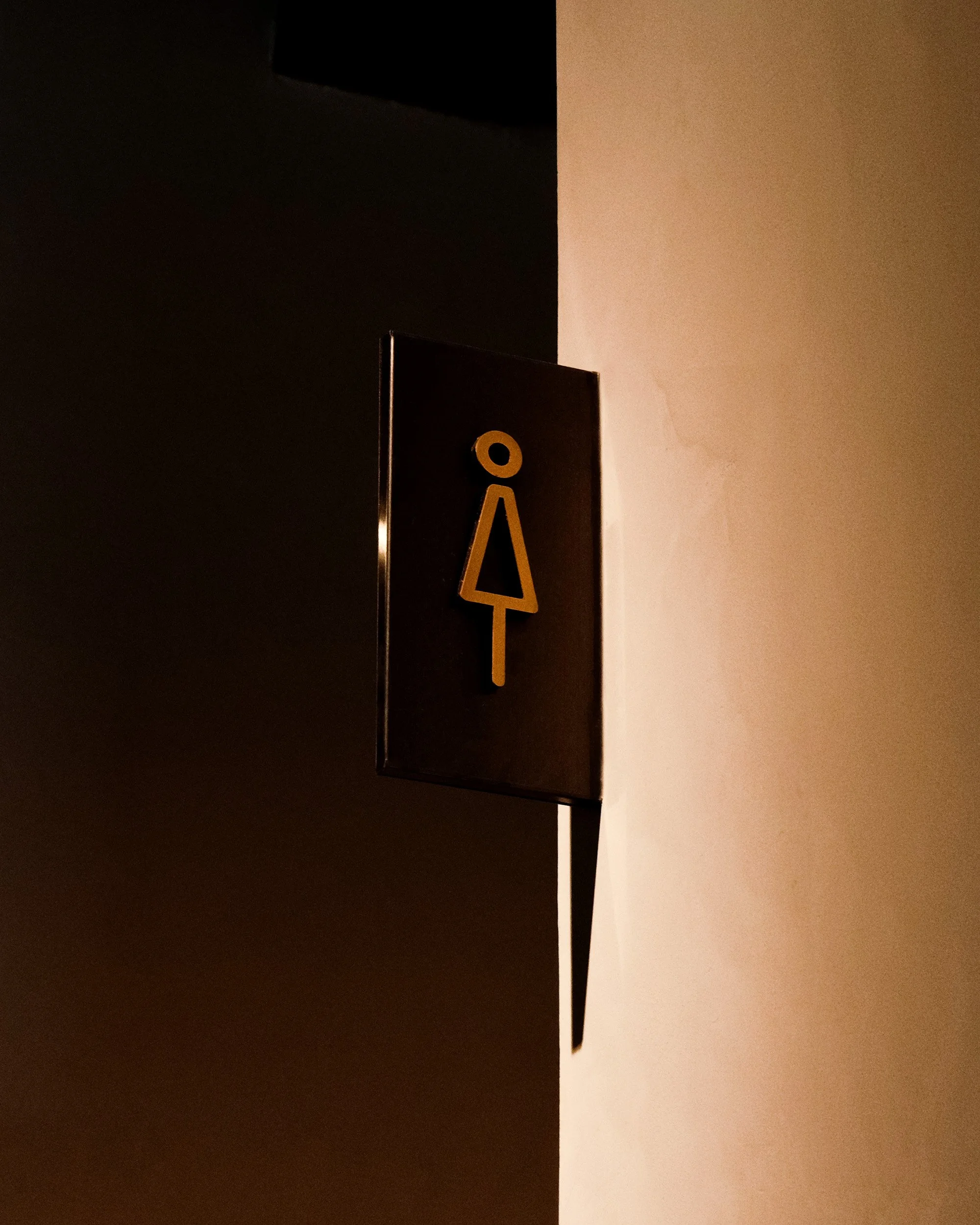
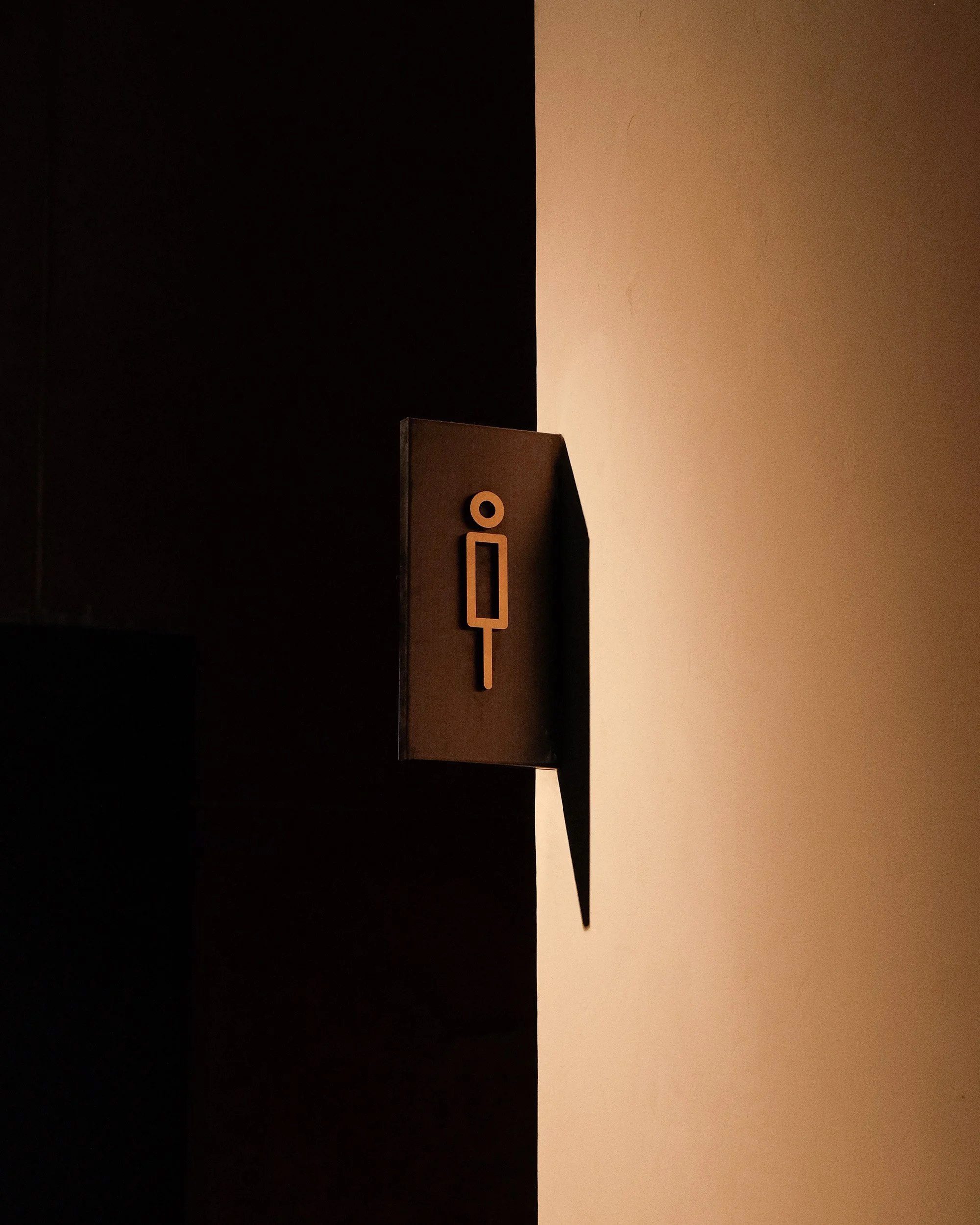
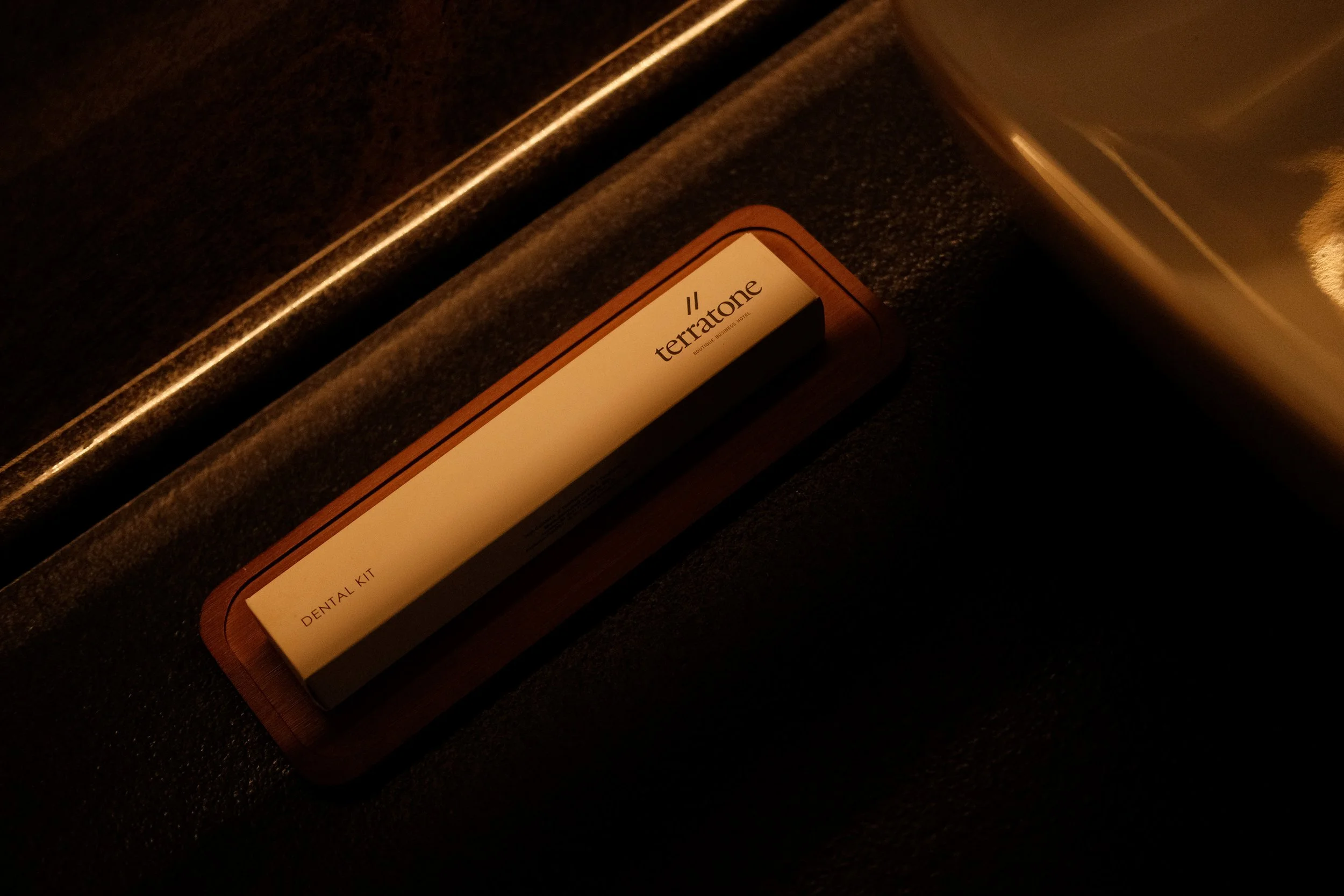
The brand visual and verbal identity has been carried forward across touchpoints in the hotel - as wayfinding signage design, hotel collaterals, room collaterals, print and digital experiences, F&B experiences, staff uniform design and more.
Our mandate also included briefing and onboarding creative agencies and hotel consulting partners (social media, website, communication, hotel consultants, printing partners, interior styling, staff uniform) and ideation and inputs for hotel SOPs definitions, scent choices, sonic elements, spatial design and F&B choices.
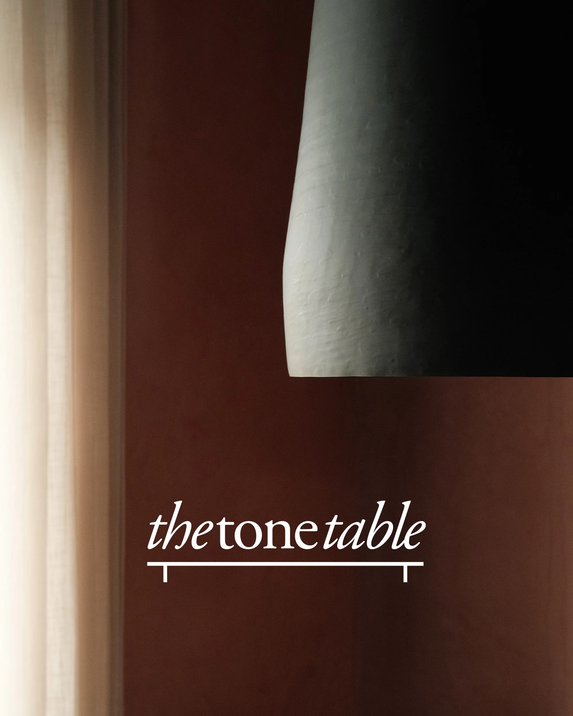
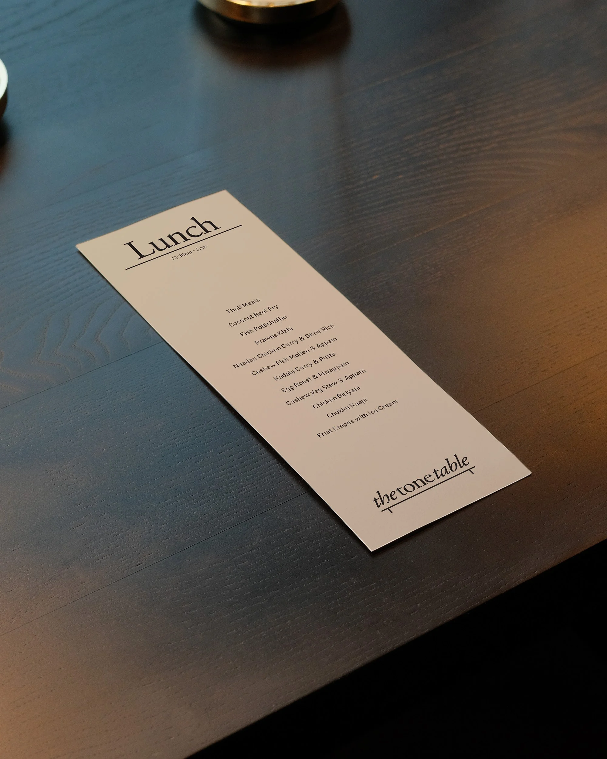
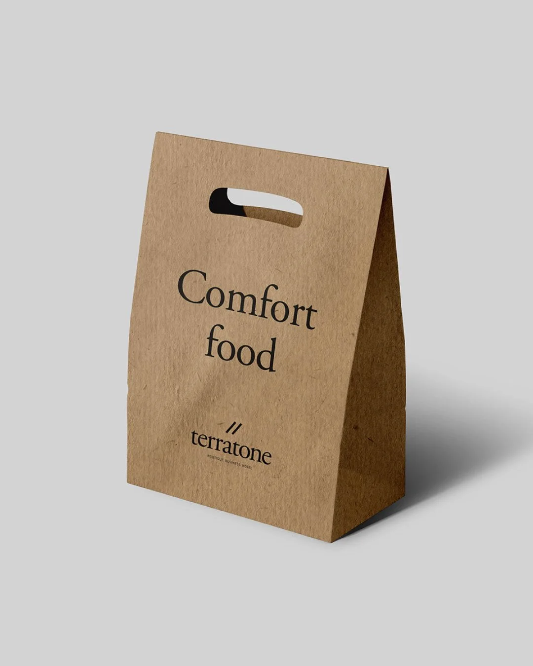
The hotel also has an F&B space - branding for the restaurant, menu design, packaging design and restaurant staff uniform design were also part of the Hue & Why mandate. The restaurant serves warm simple home food - something that business travellers seem to miss during their busy trips where they end up eating not-so-healthy food. Locally sourced ingredients, regional dishes, authentic cooking styles all add to the concept of ‘a bit of home, when away on work’. The same thinking continues across the hotel with tiny gestures to make them feel more at home, incorporated wherever possible, bringing alive the thought of ‘Warmth that Rejuvenates’.
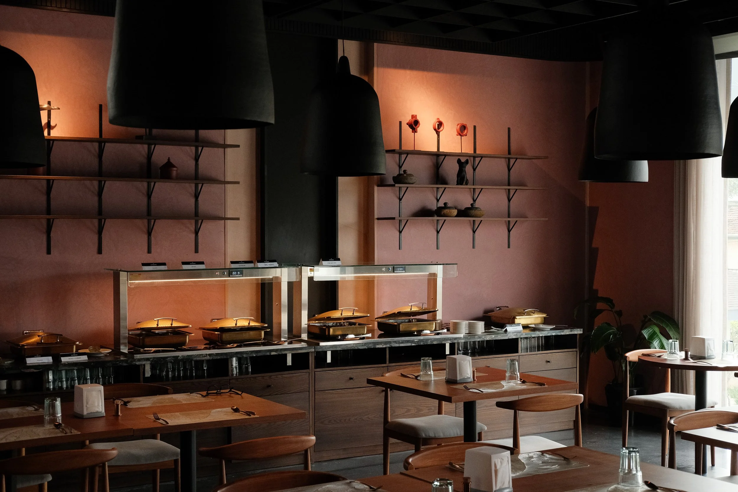
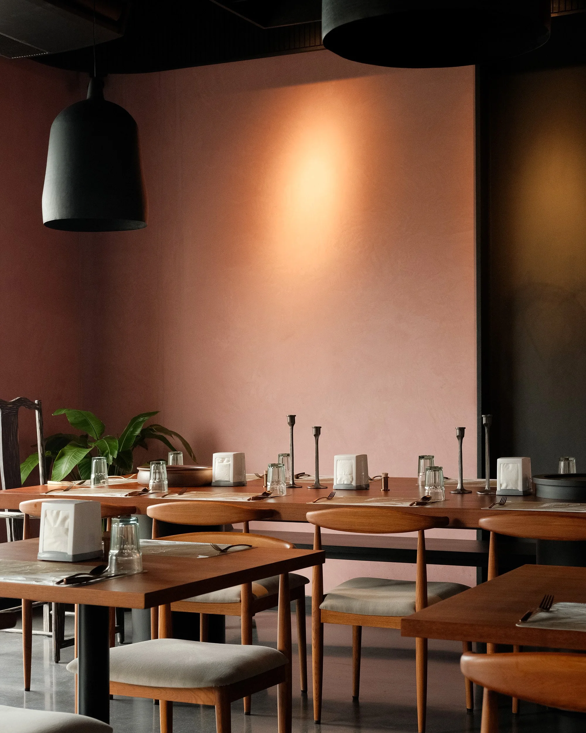

Authentic in approach, warm in hospitality and contemporary in design - Terratone is an island of calm, a warm hug, a space to pause and reset. The simplicity, elegance and warmth have been echoed in every corner of the design system - from the classic typography choices, to the pared down iconography illustrations and the minimal design collaterals.