Curegarden - Brand Refresh & Packaging Design
Curegarden is a part of Arjuna Natural Pvt. Ltd., India's leading manufacturer of standardised botanical extracts for over 30 years. Arjuna Natural has a history of patented products that have consistently set the standard for the industry and improved lives of thousands of people across the globe. The same scientific rigour and world class technology goes into the potent and safe supplements from Curegarden. Curegarden believes in helping customers live a balanced healthier life for longer - in order to help them have a more fulfilling life.
We worked on the Curegarden Brand Refresh - our mandate included Brand Strategy, Brand Identity Refresh, Packaging Design Architecture, Packaging Design Variant Coding and Label Designs. The credibility of the brand and the promise of vitality through the power of botanical extracts - that is what sets the brand apart in a fast expanding category.
The apothecary inspired design world has been brought alive with custom brand illustrations, format specific structural packaging and label design weightage inspired by shopper behaviour.


Before we began the packaging design exercise, we checked out what’s happening in the broad category of health, nutrition and supplements.
There seem to be different motivations for customers to buy into each format. we also discovered the broad design languages that exist within each format - for eg: fun and vibrant, dynamic and active, serious and professional and so on.
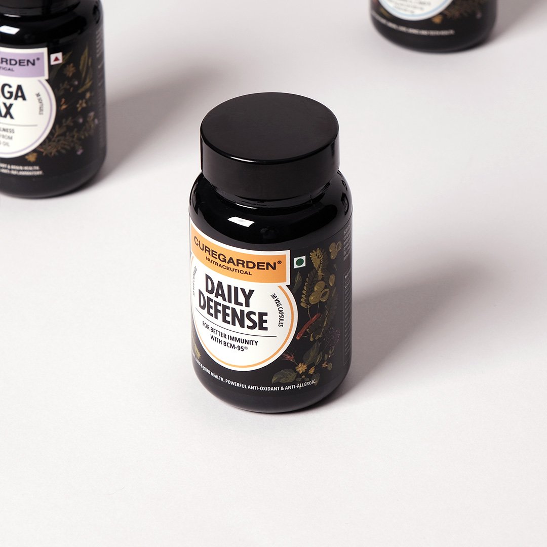
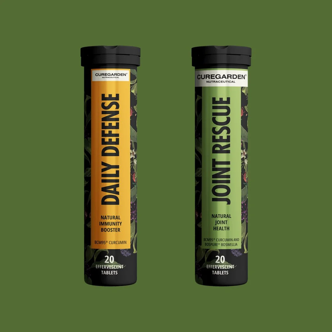
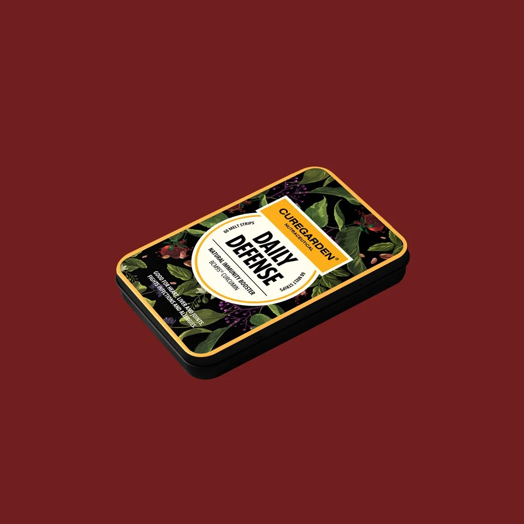
An overall unifying theme was created for Curegarden - rooted in the botanical extracts world, in order to ensure easy brand recognition. At the same time we borrowed codes from each format to ensure distinctly different structural packs and design elements to cue the formats. For eg: Rich black bottles for capsules, canisters for gummies, sliding aluminium boxes for melts, tottle packs for effervescent tablets and so on. This was a result of understanding how customers pick such products off the shelf. Images shown below:
Bottle - Capsule
Box - Strips
Sliding Box - Melts
Tottle/Tube - Effervescent Tablets
Sachets - Powder Drink
Box - Powder Drink
Jar - Powder Drink
Canister - Gummies
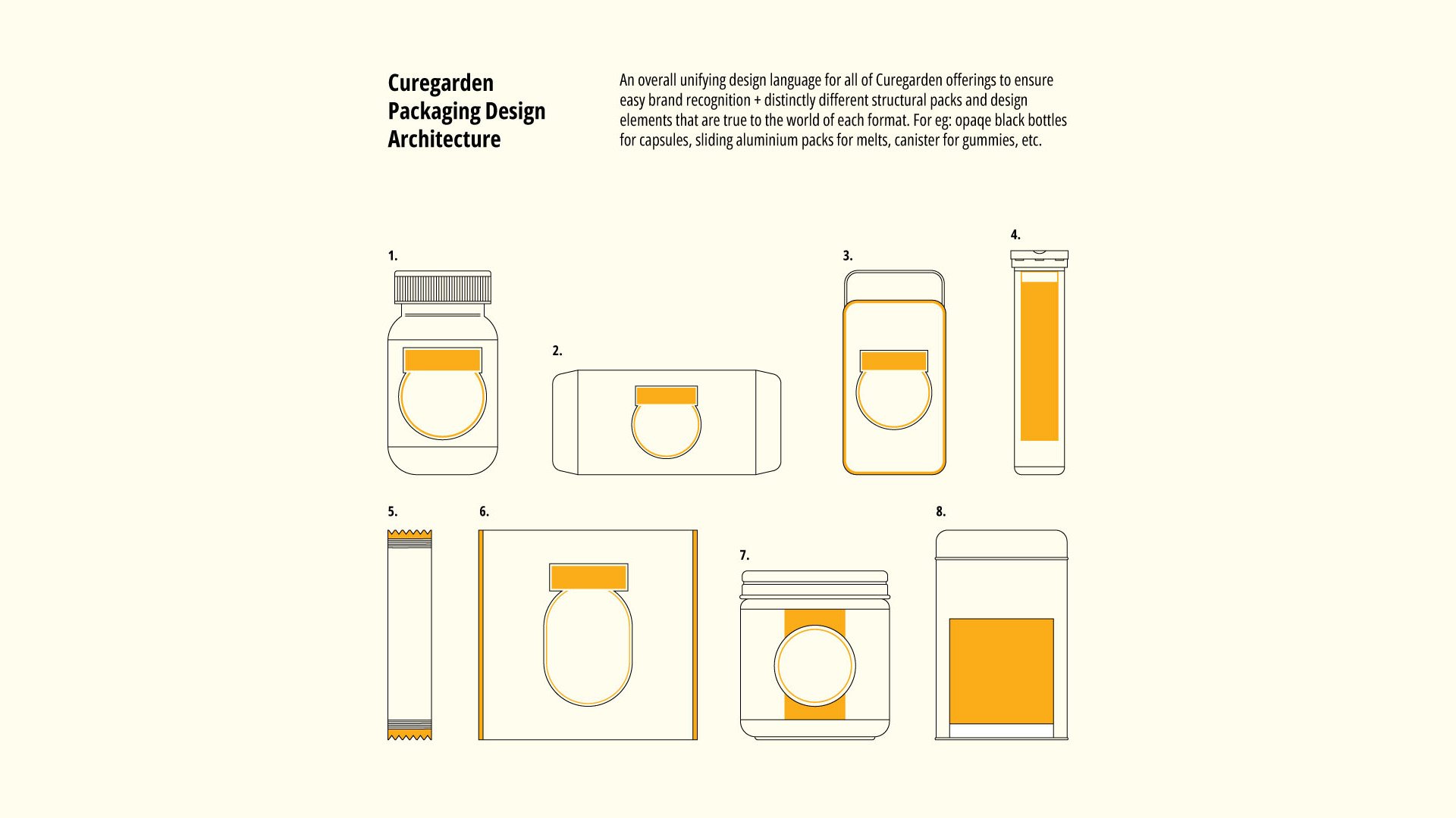
The packaging and label designs across formats show how the Packaging Design Architecture and Blueprint Plan is brought alive on the actual packs.


At the end of the brand immersions we undertook for this brand consulting engagement, we recommended a shift in the brand narrative - from talking about Lifespan to talking about Health-spans. By providing all the essential nutrients, Curgarden helps people live a balanced, happier, healthier and therefore more fulfilling life for longer number of years. Hence, the focus on health-span.

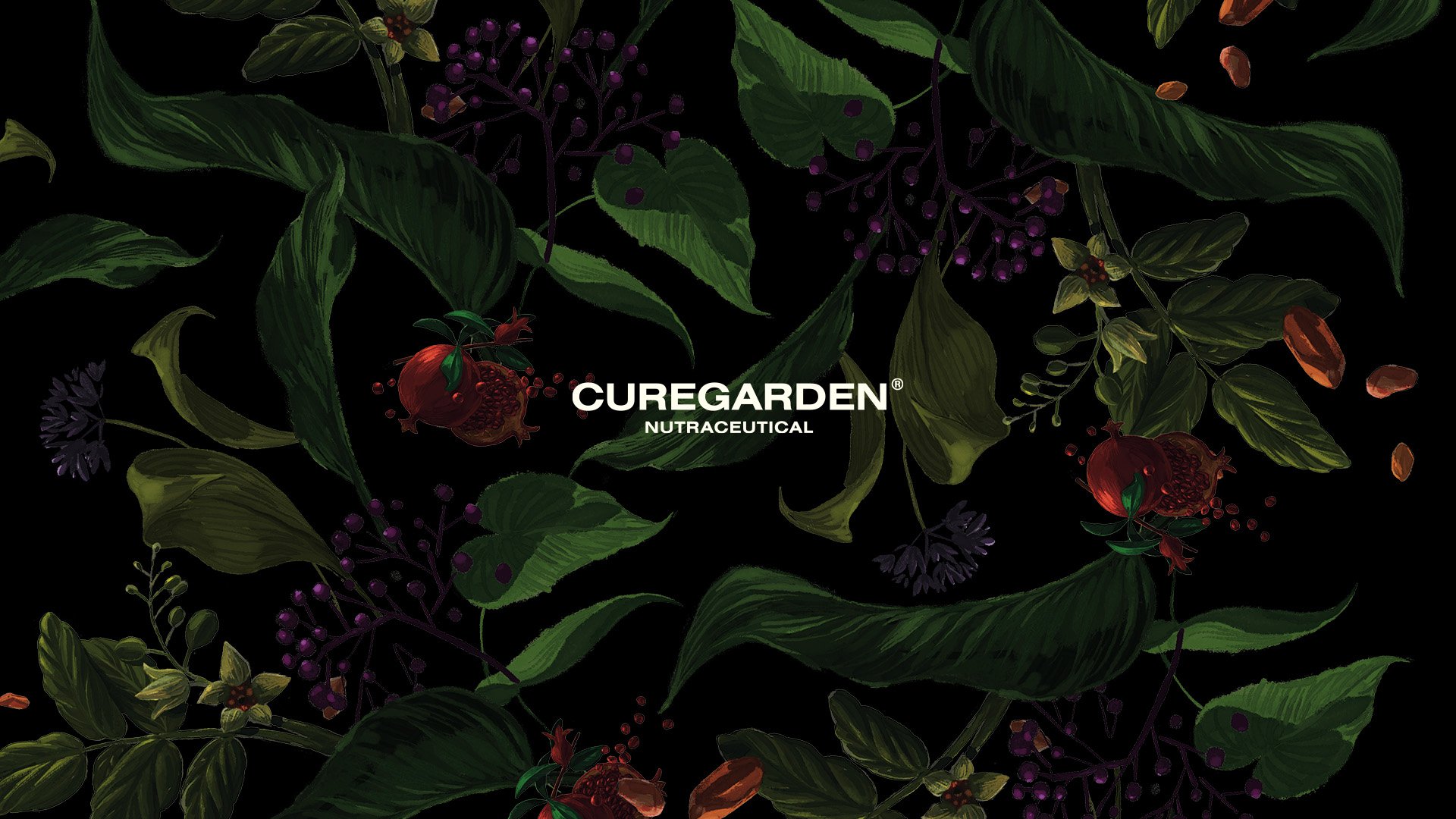
The Brand Illustration has custom made, hand drawn botanical drawings inspired by the actual ingredients used for the various products. Given below are the details of these brand illustrations.


